U.S. Bank locations

Website redesign

Overview

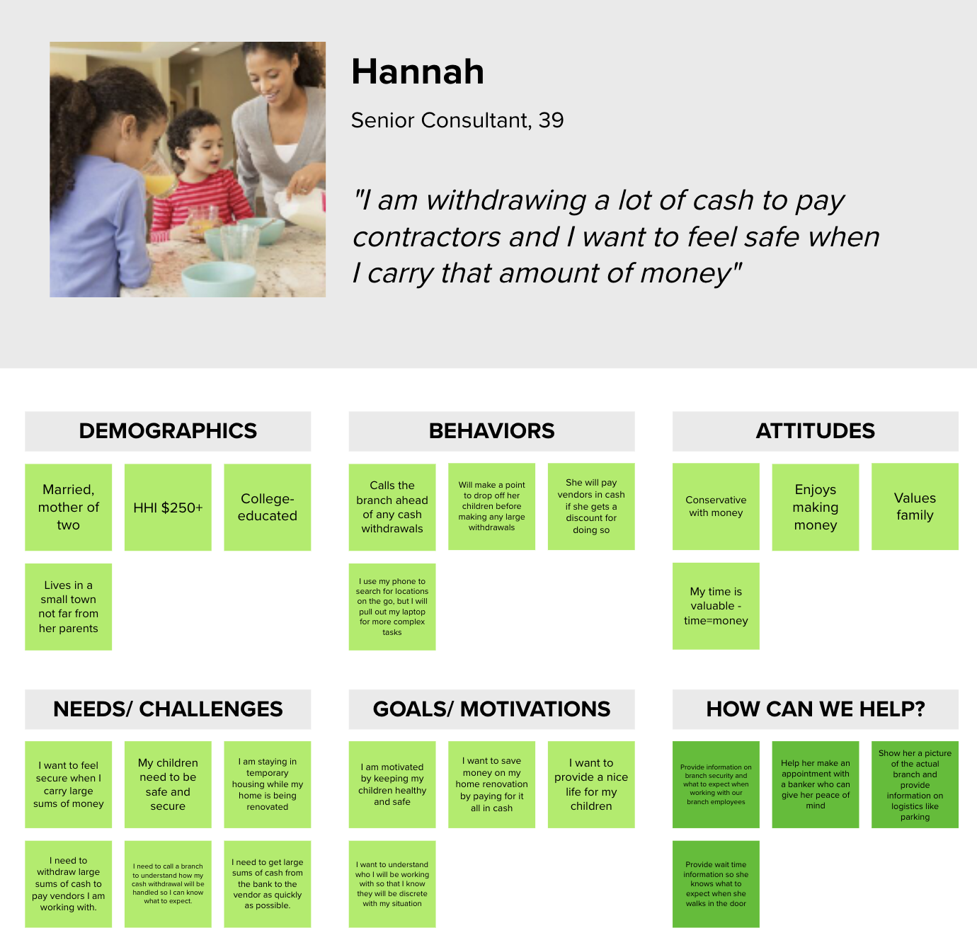
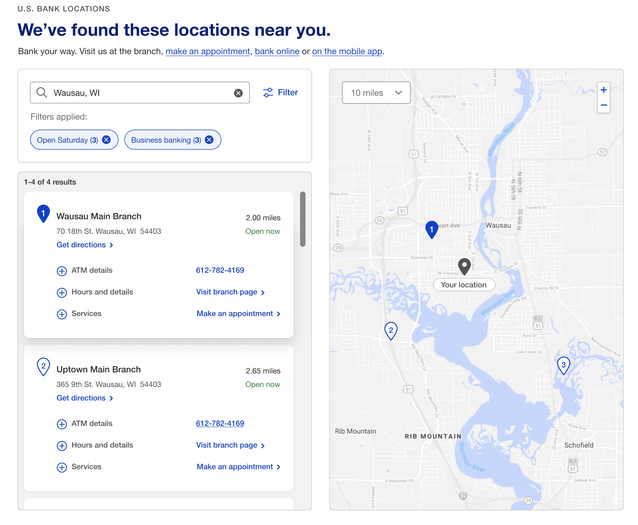
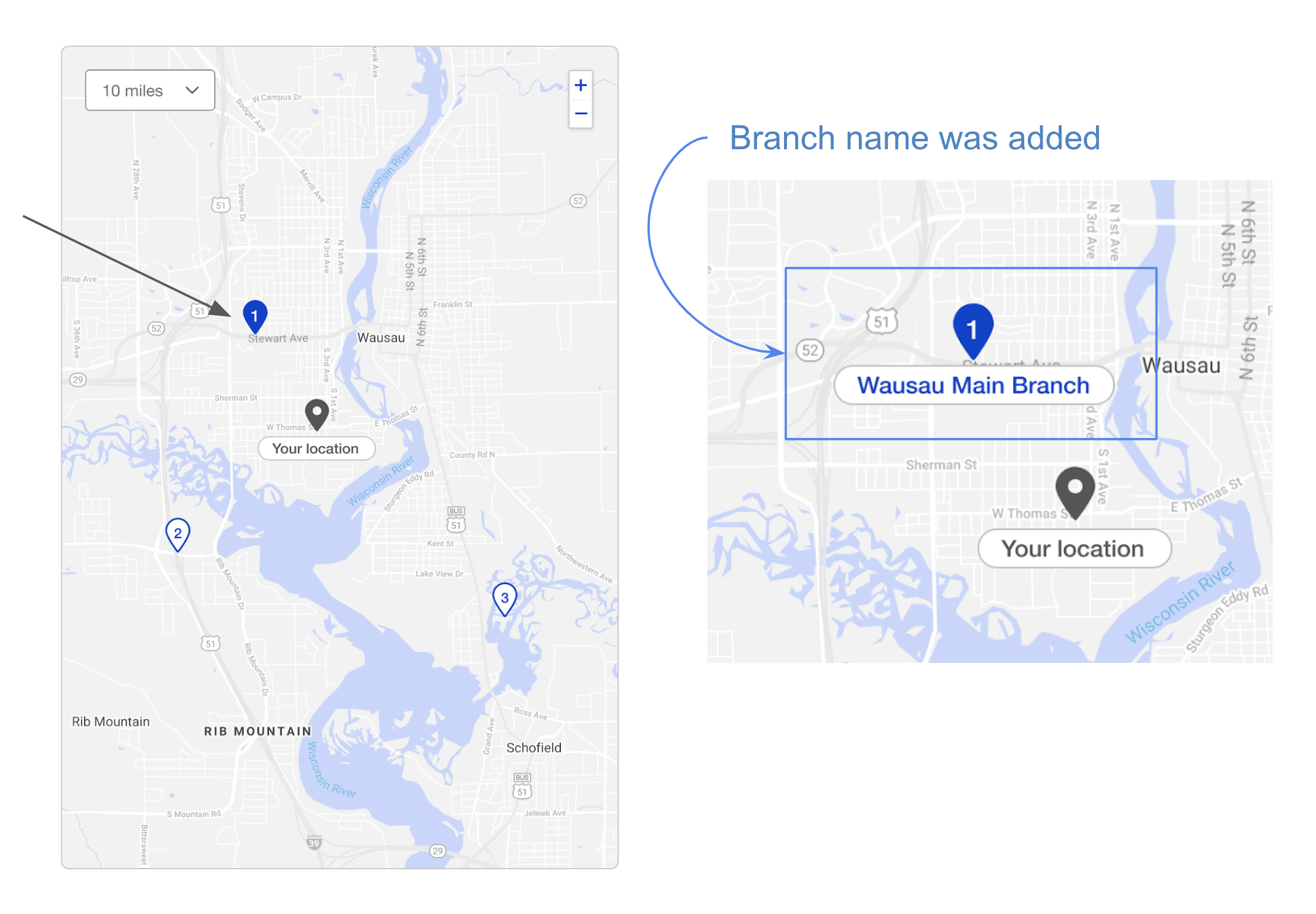
U.S. Bank’s redesign aimed to enhance page interactivity, boost SEO, and deliver personalized content tailored to target users. Foundational research on the legacy pages revealed unmet needs, such as performance lags, unintuitive card interactions, and hidden critical information.

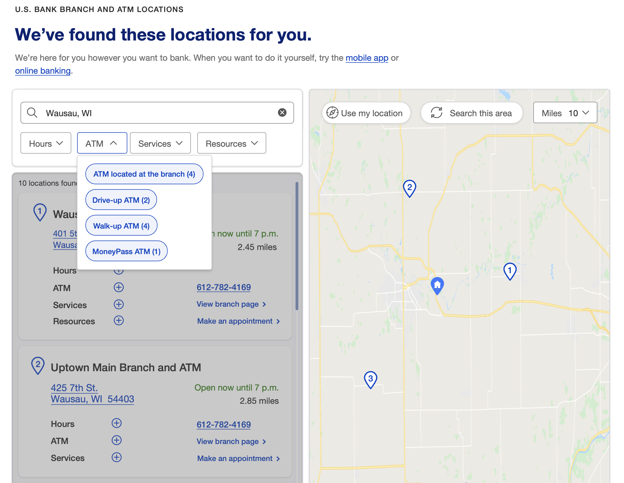
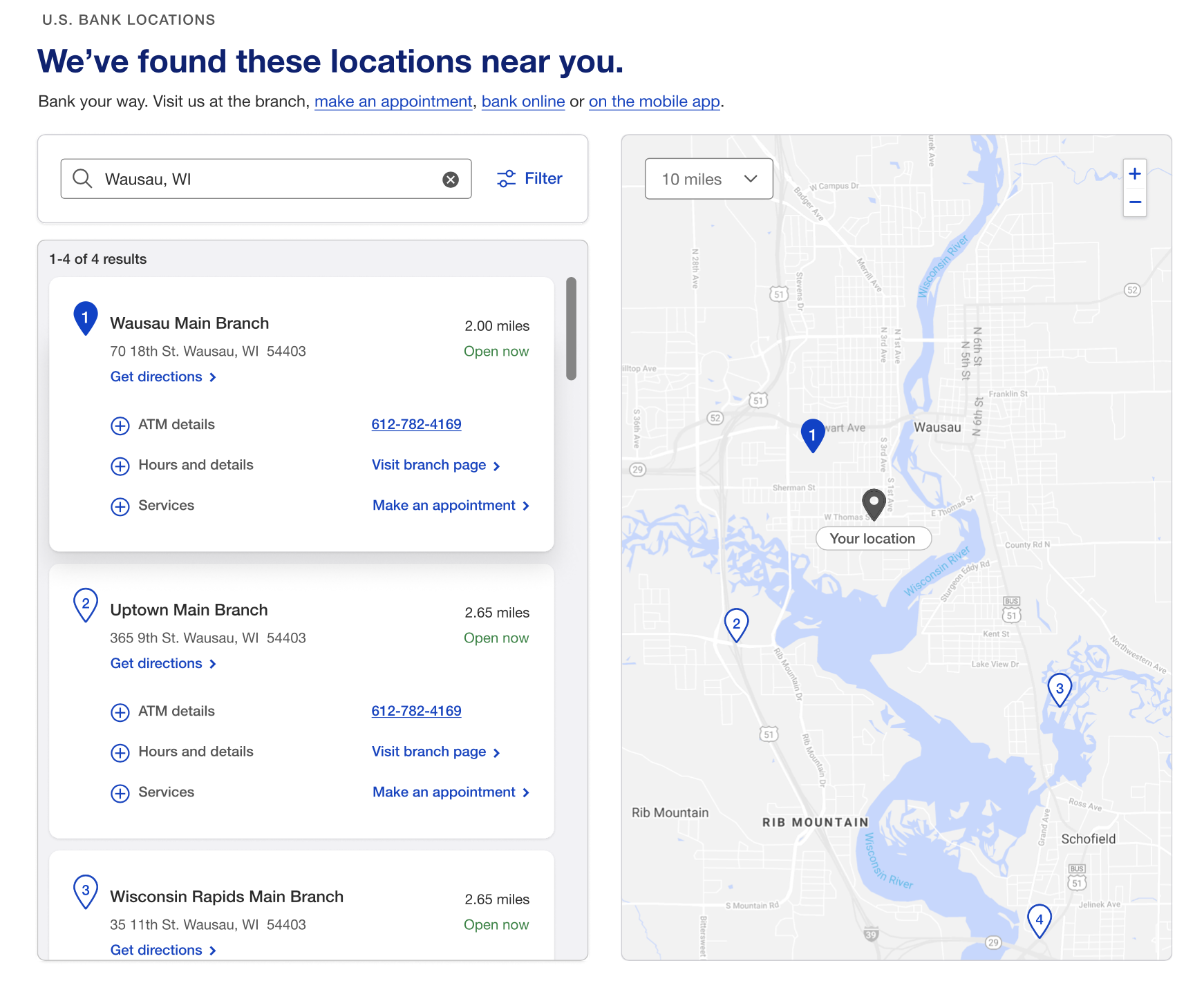
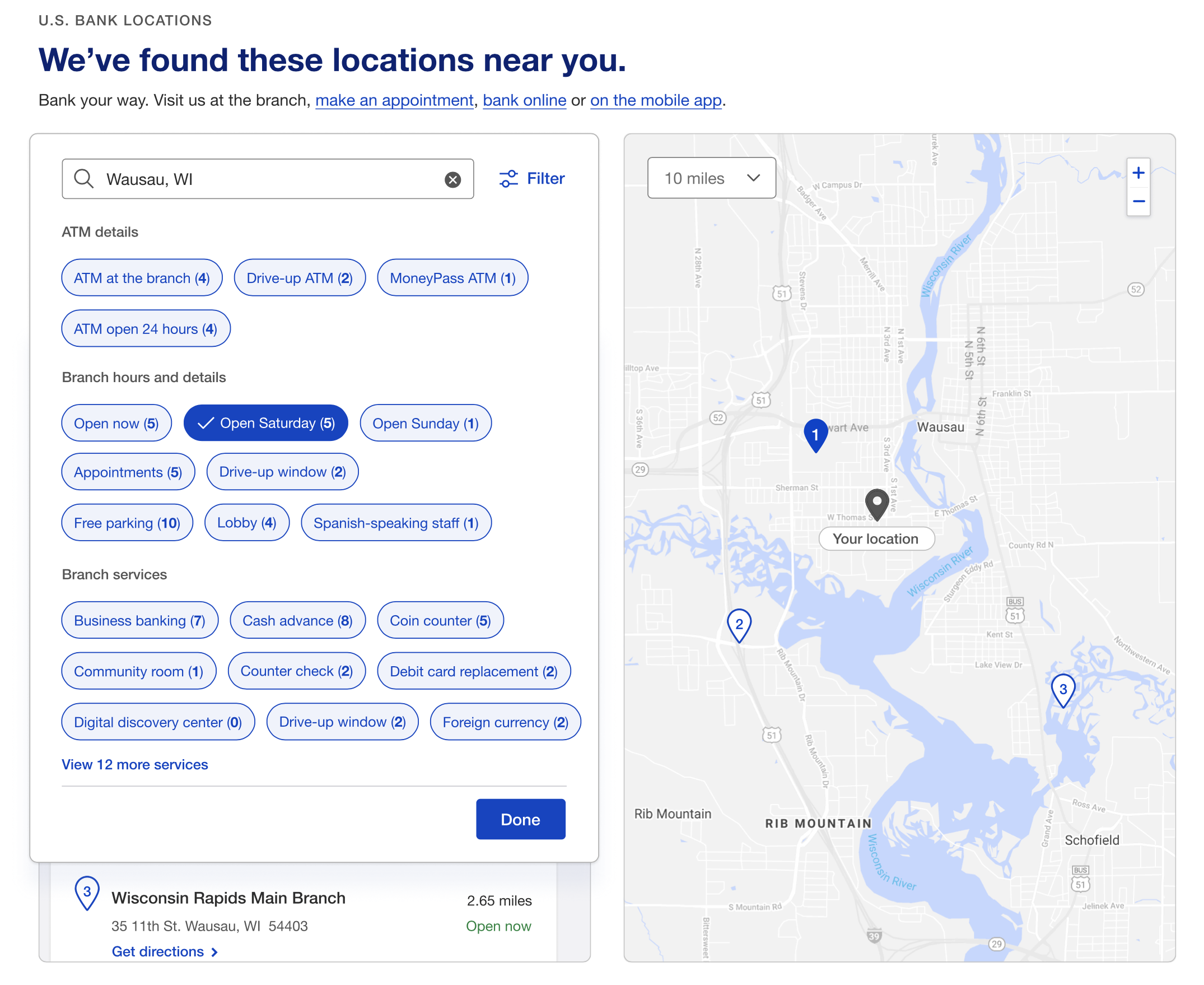
The new website’s goals focused on improving search and filter functionality, enabling self-service to reduce customer support calls, and increasing the discoverability of branches and ATMs.

Role and impact

As a senior visual interaction designer, I led the end-to-end design process, collaborating closely with content, product, accessibility, and development teams. I regularly presented design decisions and research insights to stakeholders, grounded in competitive research and user testing.

I developed high-fidelity interactive prototypes, conducting six rounds of user testing to refine the designs. Accessibility was prioritized early through weekly co-creation sessions. The result was a significantly improved user experience that met business goals, earning me a Gold Shield Design Award.

Team
Content strategy, Engineering, A11Y, Product

Duration
11 Months (2022)

Software
Figma, Jira, React

Website roadblocks

1) Problem: Slow load time on pins and result cards.
Goal: explore why is that happening, how to simplify the experience.

2) ProblemResult card slides to the right, and ‘Make an appointment’ and ‘See branch details’ CTAs are hidden below the fold, therefore most users don’t see them.
Goal: increase appointment making and banking online by moving CTAs above fold.

3) ProblemFilter list is not comprehensive.
Goal: make filter menu more prominent and explore the possibility of filter grouping.

UX process

Foundational research: User interviews, heuristic analysis, problem definition, and 3 personas. Design workshop: Brainstorming session with stakeholders and core team. Six rounds of design & testing: Prototypes tested with 10 users per round, including usability studies and card sorting. Accessibility reviews: Weekly sessions with accessibility consultants. Cross-team alignment: Bi-weekly syncs with locator teams working on similar experiences. Tiered design reviews: Stakeholder approvals and deferrals at key milestones. Weekly design reviews: Twice-weekly core team alignment on design decisions. Developer syncs: Bi-weekly meetings to align on technical needs and constraints.

Goals

Business goals: 
Improve user experience, decrease customer service and branch calls, increase self-service appointment making.

Design goals:
Create a simple, delightful experience that allows users to explore and find what they need, one action at a time.

Content goals:
Present educational and actionable content without making assumptions about users’ needs. 

User testing

In one testing round, we evaluated filter treatments, content clarity, and search behavior across 10 users. Key insights:

  • Chip filters preferred for simplicity over alternative treatment (7/10).
  • ATM information needed to be more prominent and accessible (6/10).
  • Most users searched first rather than filtering (7/10).

In round 3, we evaluated dropdown filters and refined filter categories through card sorting. Key insights:

  • Dropdown filters were intuitive but ruled out — inconsistent with the design system and created category ambiguity (9/10 found them easy, but users were unclear what “Resources” included).
  • Card sorting revealed users prioritized Hours and Info first, followed by ATM, Services, and Resources — directly informing the final filter taxonomy.

MVP designs

Default view and card design

The results page features a search box with filters, a map with pins, and scrollable result cards showing 10 items at a time. Selecting a pin highlights the corresponding card — and clicking a card turns its map pin blue, creating a clear two-way visual connection between list and map. Result cards are interactive and expand on click to surface additional details. On hover, card elevation changes to signal interactivity. A “Load More” link at the bottom handles pagination.

Filter menu

While designing the filter menu, I explored options like showcasing the most popular categories or consolidating them to reduce cognitive load. However, user research revealed that customers preferred seeing all filter options upfront before deciding to visit a branch or ATM.

The filter menu is dynamic—when a user selects a filter chip, the results instantly update on the map, providing immediate feedback

Filters applied

Selected filters appear as removable chips below the search bar, keeping users informed of their choices. This design allows users to easily clear filters directly on the results page without needing to reopen the filter menu.

Accessibility considerations

Early in the process, I collaborated with accessibility consultants who identified and helped resolve several design issues. Location text was added below map pins for clarity, and a “Get Directions” link was included on the cards to improve usability for users with disabilities. Additionally, I removed a gradient at the bottom of the results page to enhance readability for sighted users.

Creating components for Shield design system

As part of the design system team, I led the end-to-end research and design of the Menu Button component — addressing inconsistent usage and misapplication across products. Through competitive analysis, an internal usage audit, and user testing, I defined a clearer interaction model and updated guidelines that resolved ambiguity for developers. The outcome was a new standardized component adopted across teams, unblocking development and bringing consistency to a frequently misused pattern.