HouseMugs
Native app design
Overview
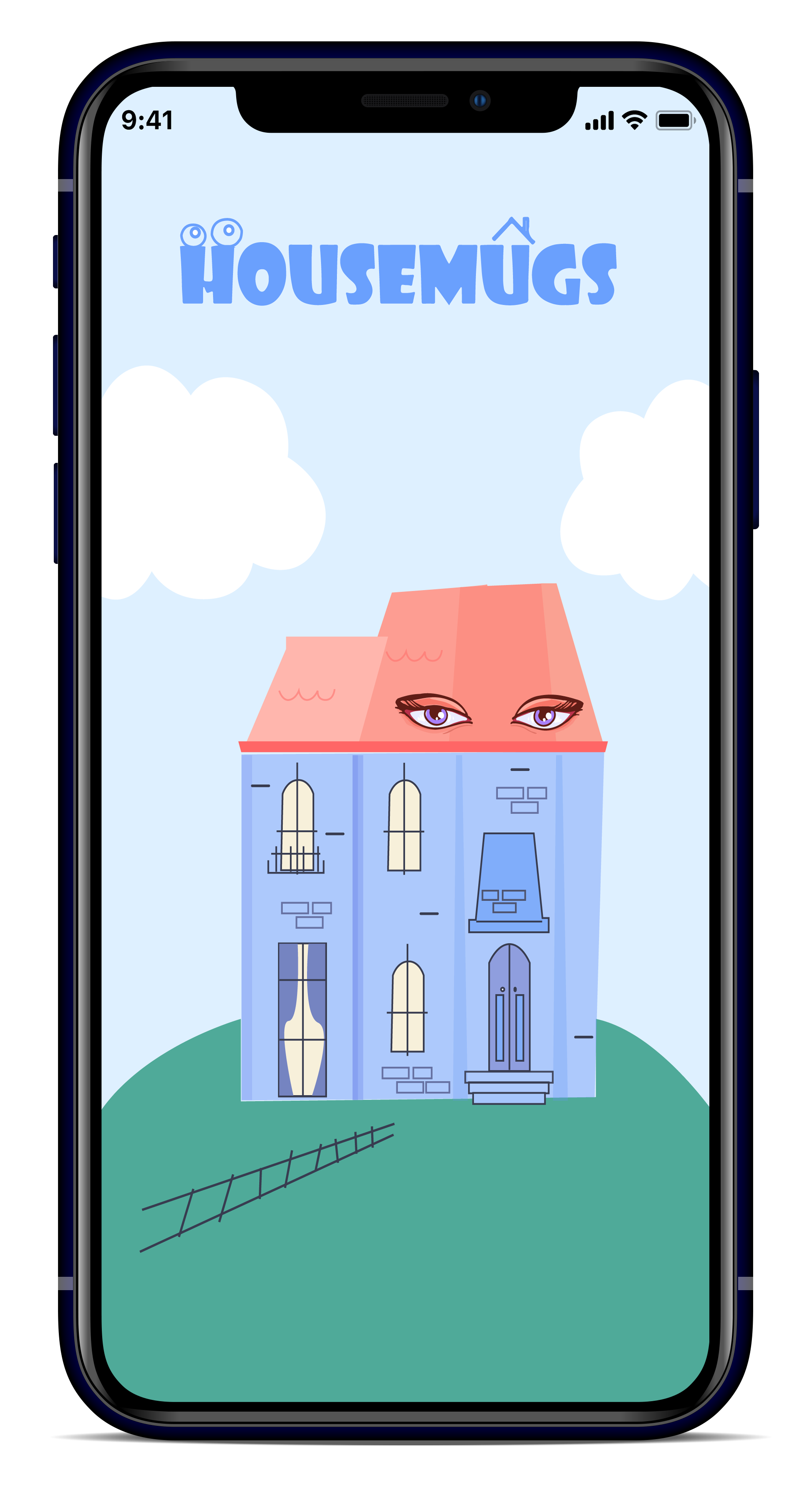
HouseMugs is a new product line aimed at providing an easy-to-use digital experience for customers who want to customize their outdoor house decorations.
Business goals include educating customers about the custom design process, implementing an automated measuring service, and generating excitement around the brand.
My role and responsibilities
As a Visual Interaction Designer in a team of three, my role was to create an intuitive and memorable user experience through new interface design, branding, motion, and animation.
Key Contributions: user testing, visual design, animation and interaction design, wireframing, and prototyping.
Team
Three designers
Duration
6 weeks (2020)
Software
Adobe XD, Ilustrator,
Photoshop

The problem
HouseMugs’ current production process is overly manual and complicated, leading to confusion among customers who struggle to understand the measuring process.
The steps in the current workflow are as follows:
- Customers make a personal visit to validate measurements
- In-house designers create custom designs
- Designs are presented to customers for approval
- Final designs are fabricated and delivered
Defining the scope
After analyzing HouseMugs’ current workflow and client specifications, we defined our scope to include:
- Designing an intuitive digital experience
- Developing a custom design feature
- Streamlining the measurement process
- Creating a memorable visual design
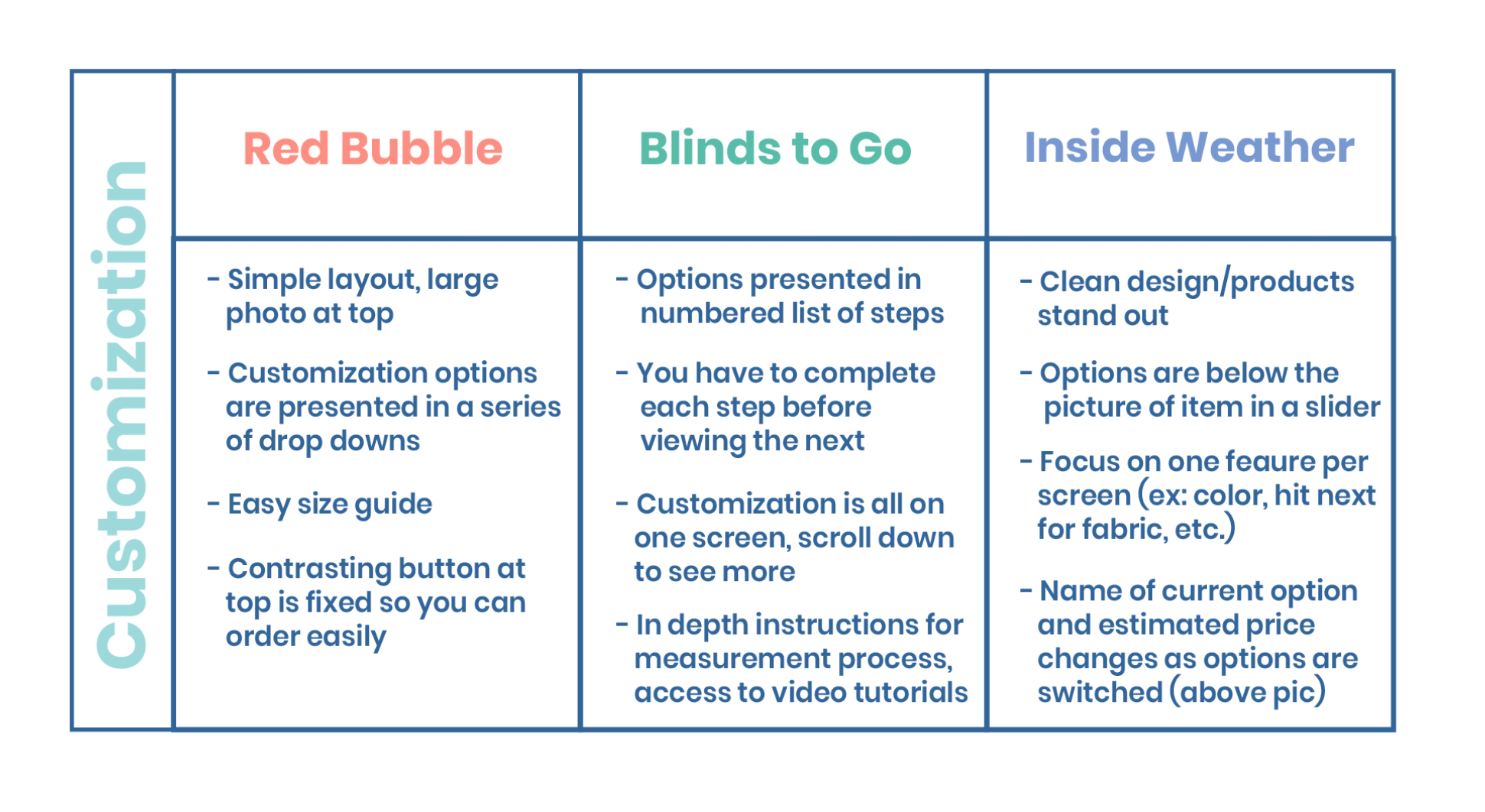
Searching for customization examples in comparative research
I examined indirect competitors with custom design features in their digital applications, and Inside Weather stood out. After a product is selected, a horizontal scrolling menu appears with various options. Tapping on the desired color or material makes the change instantly visible on the screen, providing an intuitive and seamless user experience.
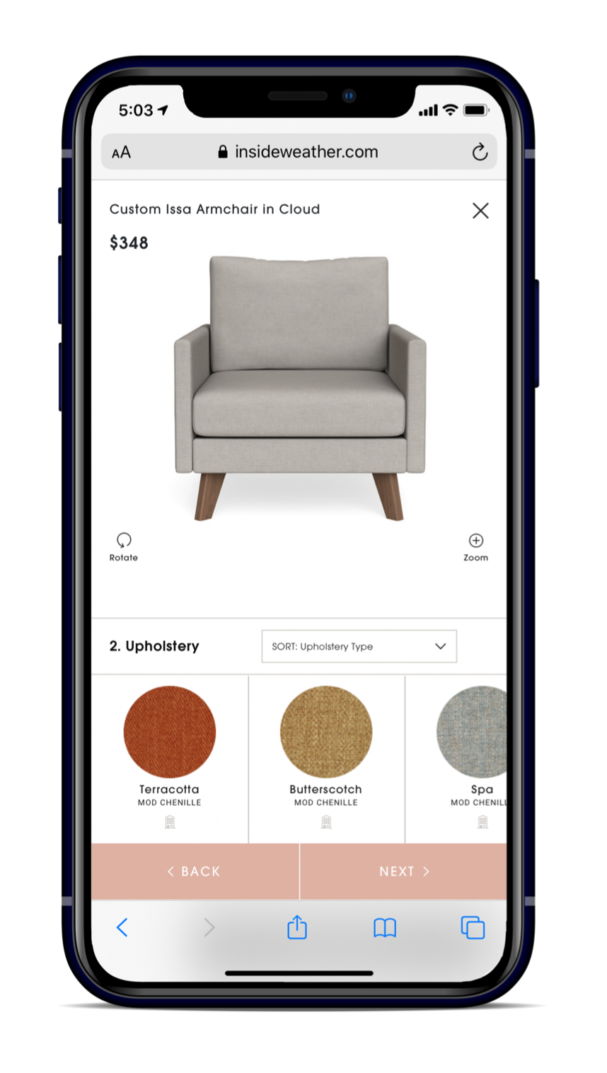
Inside Weather — a custom design furniture app
Implementing lean UX with the creation of a mvp
We adopted a Lean UX approach to develop a minimum viable product to allow for frequent user testing, and inform our design decisions based on findings.
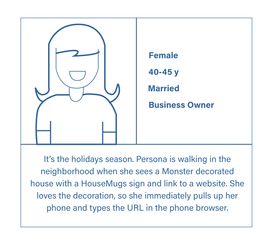
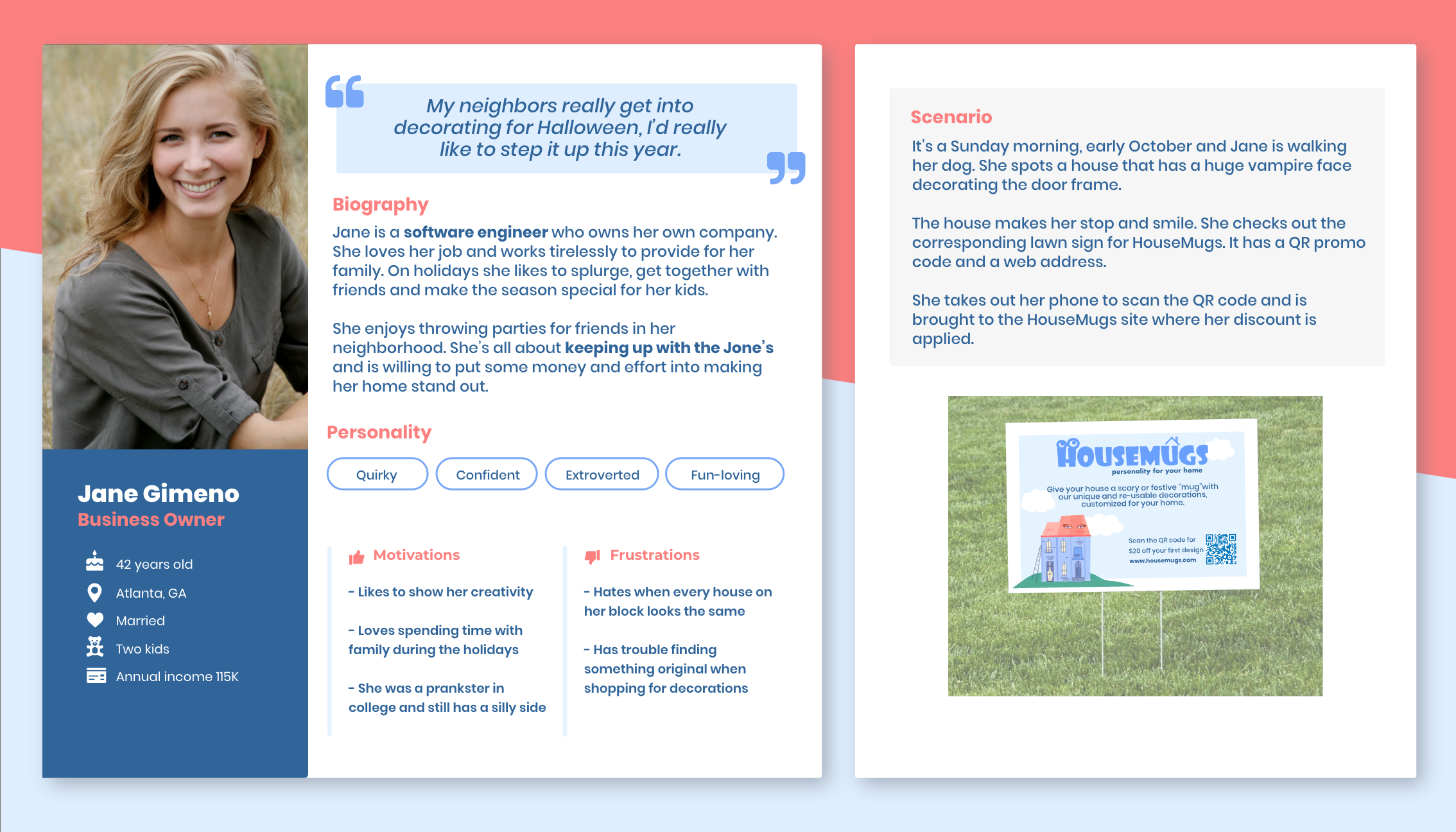
The first step was creating a Proto-Persona, which helped us define our ideal user and the necessary steps for designing custom house decorations.
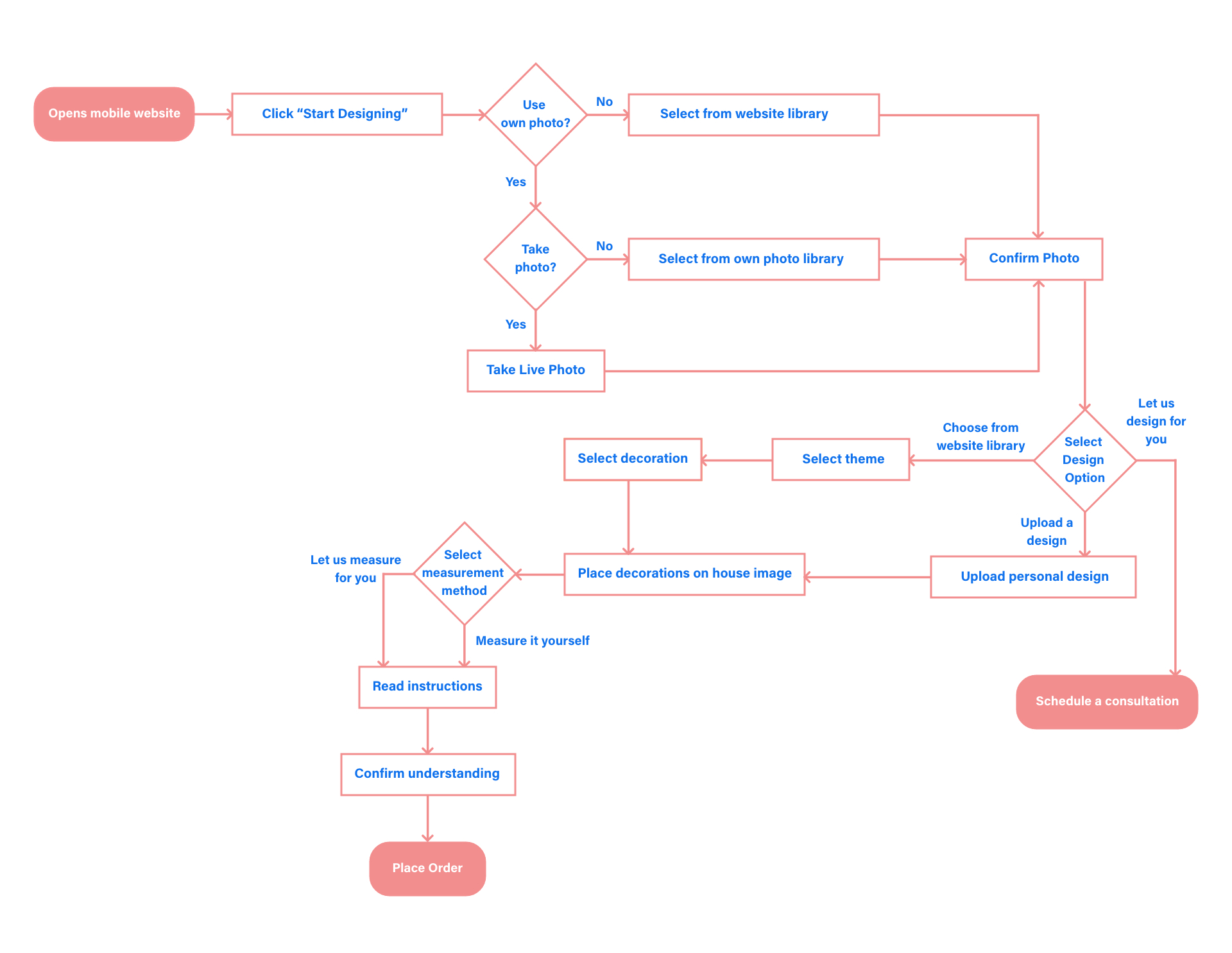
The video to the right and the user flow below illustrate how the persona interacts with the product.
V1 prototype
User flow — designing a house decoration and placing an order
Design decisions based on user testing
Below are the changes made in the second iteration of the prototype based on user feedback.
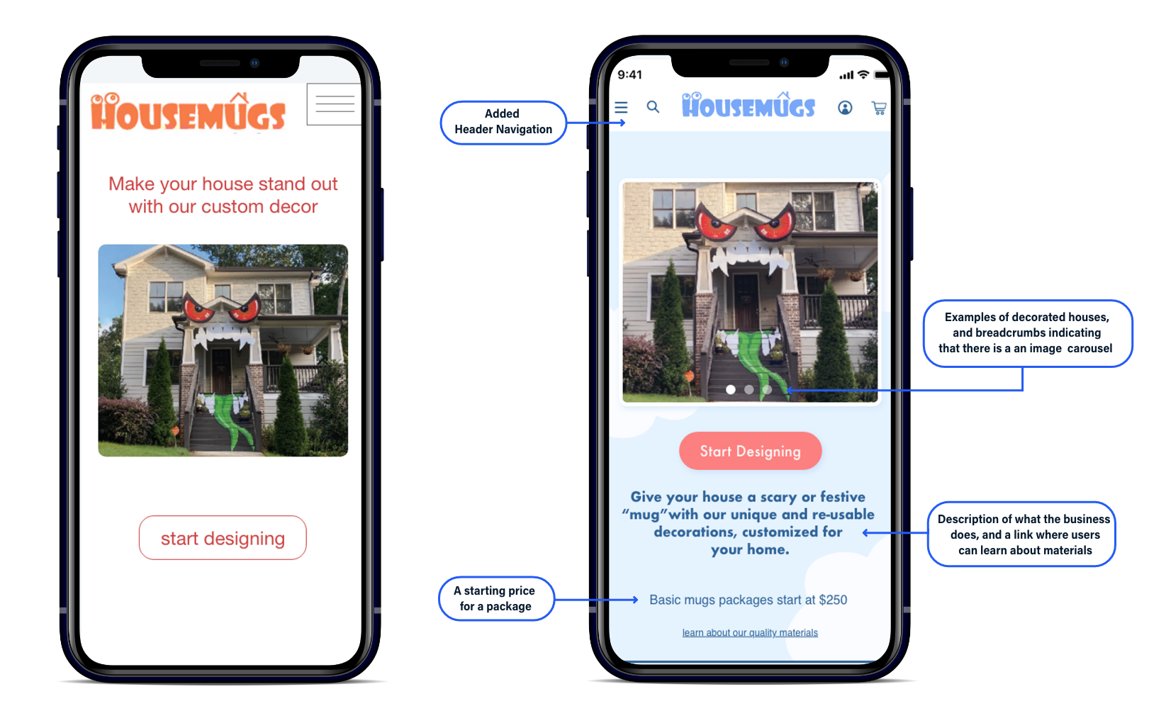
Home page iterations
User testing revealed that customers were unclear about the product’s purpose and needed more clarity from the start of the flow. As a result, I added additional information at the beginning to better inform users.
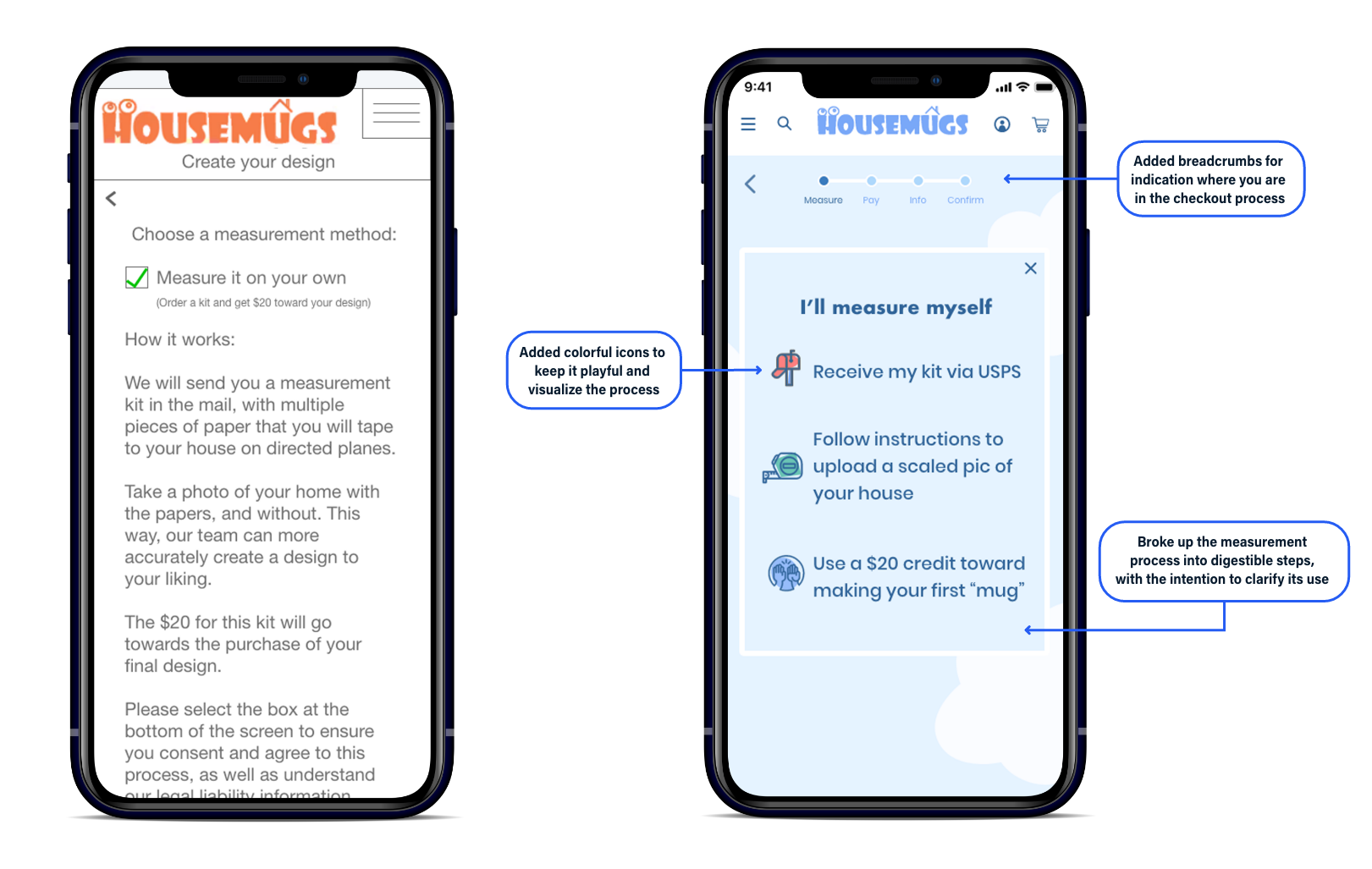
Measurement page iterations
Despite reading the lengthy explanation, users still didn’t understand the purpose of the measuring kit. To address this, I added a progress bar at the top and streamlined the instructions into digestible steps, paired with icons to visualize the process for better visual clarity and balance.
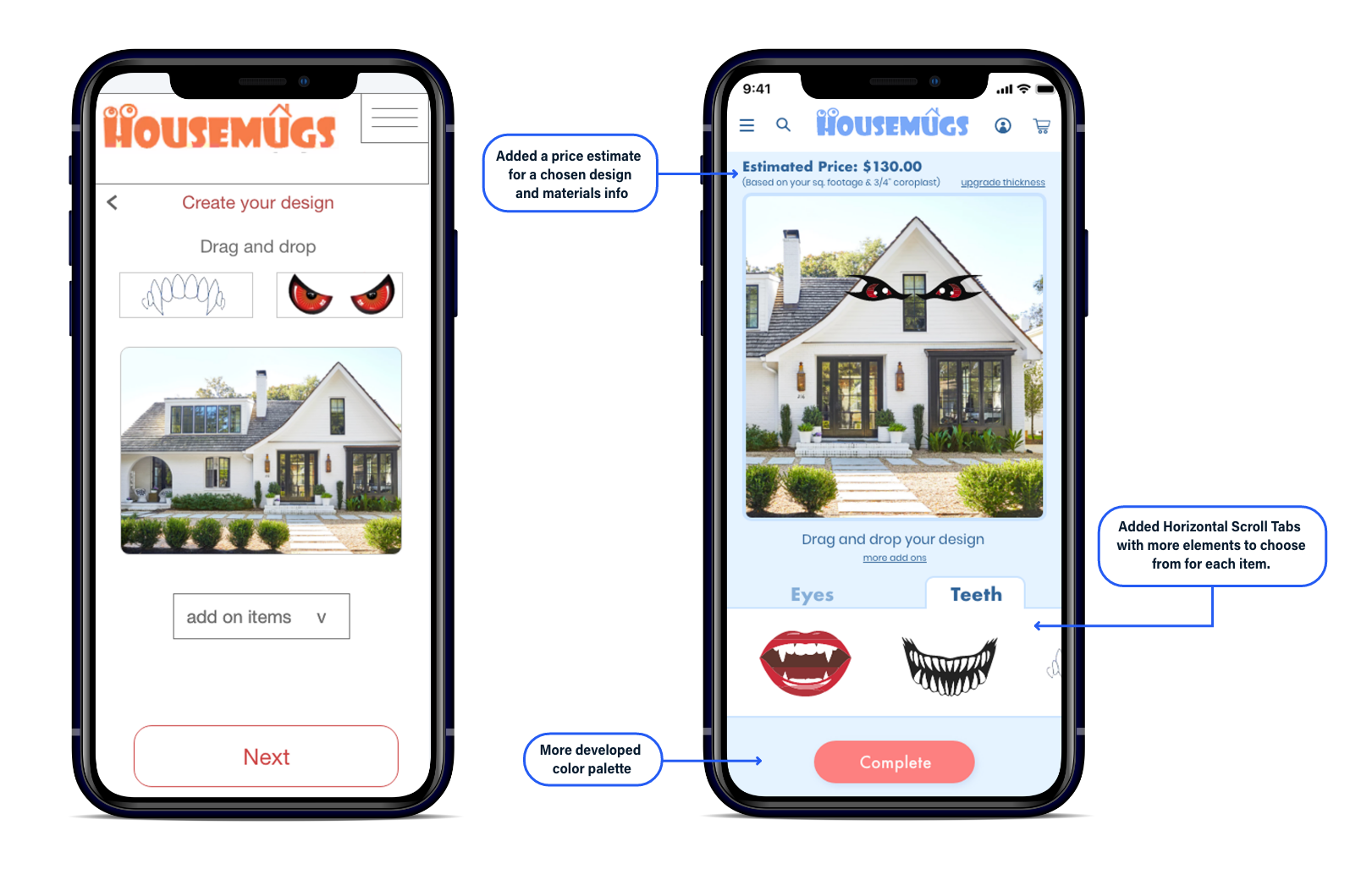
Customization page iterations
Users expressed a desire to explore more design options and gain a deeper understanding of the materials used in their custom creations. They wanted the ability to experiment with different choices and access detailed information about the materials, such as texture, durability, and environmental impact, to make more informed decisions about their designs.
HouseMugs production process evolution based on user testing results
To address the confusing production process, I reversed the steps, allowing users to design first and pay for measuring services later.
User testing revealed that while users preferred designing first, they were still confused by the need to check out twice—once for the Measuring Kit and again for the final product.
After presenting the findings to the client, we added an “Estimated House Size” option, which provided a production cost estimate, eliminated the need for two checkouts, and reduced bounce rates.

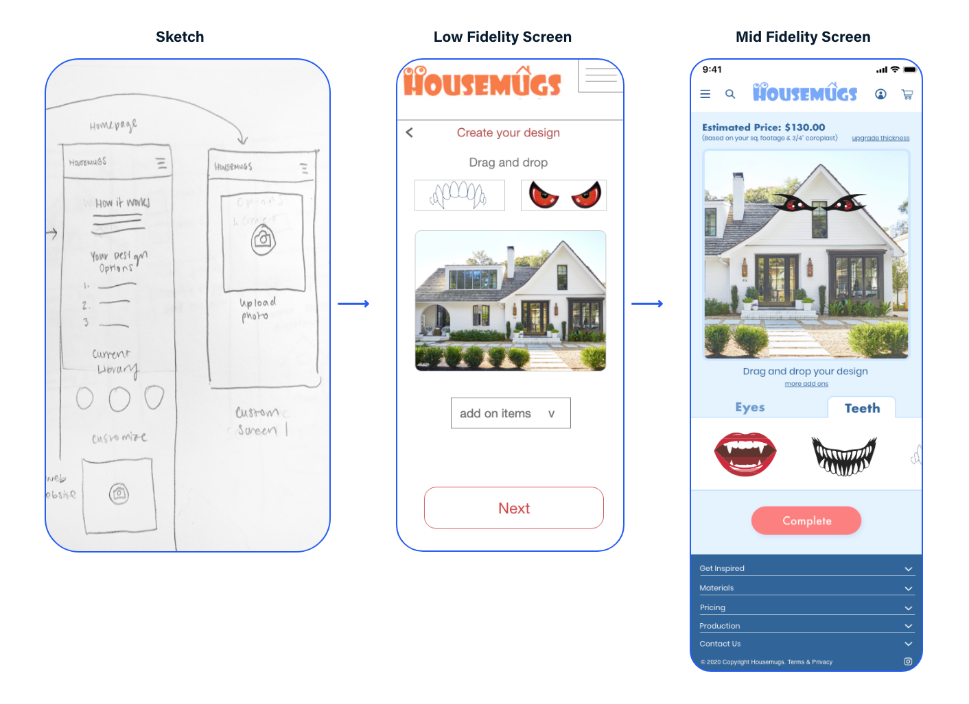
Improving the user experience by adding visual design and animation
Building brand recognition by creating a fun welcoming animation
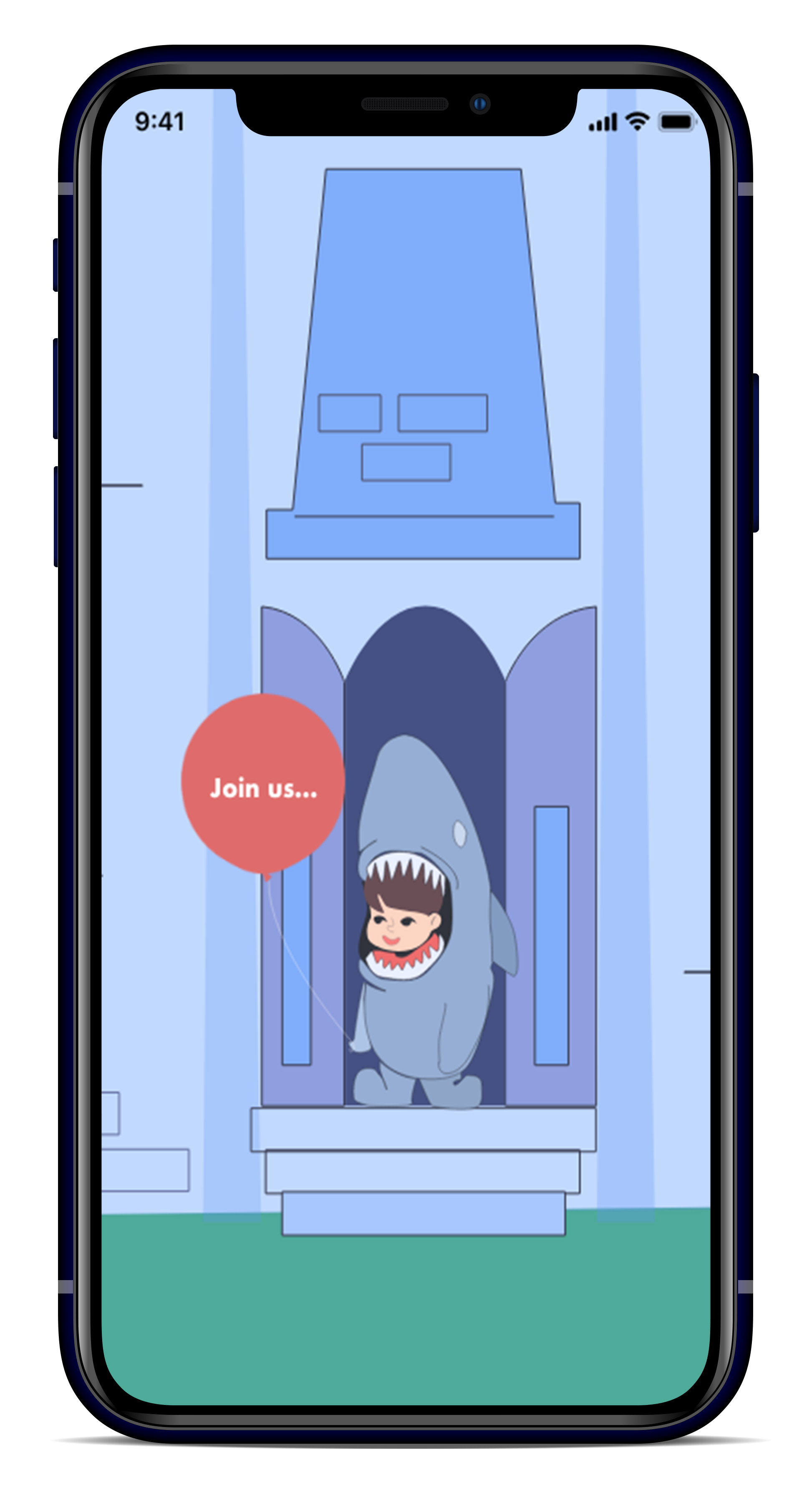
Keeping the brand specification in mind—targeting families who want to design together for the holidays—I created an engaging introductory animation to set the tone for the experience.
This animation served as a welcoming, visually appealing introduction to the site, allowing customers to immediately connect with the product. It showcased the fun and collaborative nature of the design process, helping users understand the product’s capabilities and encouraging them to explore the site further. By creating a seamless and interactive entry point, the animation aimed to enhance the user experience and foster excitement around the product.
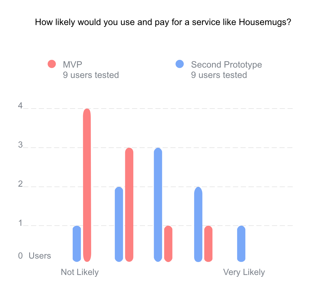
User testing showed increased desirability
We asked users, “How likely would you be to use and pay for a service like HouseMugs?” Results from the first and second usability tests showed that the additions and changes significantly improved the user experience. The likelihood of users choosing HouseMugs for their decorations increased from the first to the second iteration of our prototype.
Defining the persona and their use of the mobile prototype
After synthesizing the research, this is how the Persona was defined.
Her use of the app is shown in the prototype below.
The persona using the design feature and checking out
Learnings
Our research revealed that some customers misunderstood the term “Housemug” as a compound word, and had a negative association with the phrase “my house got mugged.” We recommended that the client rephrase these terms to better align with customer expectations and avoid confusion.
Additionally, we found that many users were reluctant to purchase the Measurement Kit due to confusion surrounding the measuring process. While we suggested further research to simplify and streamline the experience, this was outside the scope and priorities of the client for the current project.
