The Nielsen Media Portal is a data delivery platform serving major clients like Disney, Amazon, and NBC Network. Representatives from these companies access the site daily to review ratings and analyze data through downloadable documents.
The existing website faced significant user challenges, particularly in its information architecture and usability, prompting a need for reevaluation and improvement.
My role and impact
As a Senior Product Designer, I synthesized user research into actionable insights and created five high-fidelity prototypes for user testing. Each prototype’s success was measured and compared to the current design. On a scale of 0 to 10, the current offering scored 3, while our proposed prototype scored 8.
I also presented our findings to Nielsen stakeholders weekly, securing their buy-in for the proposed changes.
Team Five teammates
Duration 6 Months (2021)
Software Figma, Zoom
The problem
Product goals, challenges and vision
Our goal was to redesign the Nielsen Media Portal to be both useful and usable for users worldwide. We also aimed to quantify how much the proposed designs improved upon the current Nielsen offering and potential competitor products.
Key challenges included an overwhelming volume of information, confusing navigation, difficulty in finding data files, and redundant features and labels.
Our vision was to understand the users, their workflows, goals, and pain points. We sought to simplify the existing Nielsen Answers information architecture, enabling quicker access to content while creating a seamless, holistic experience.
User problems
After five rounds of user interviews conducted with customers using the current website and the new prototype, our research revealed:
Both admins and customers require a more streamlined navigation and clearer information architecture.
Admins need an improved method for uploading documents.
Customers need a simplified, functional homepage/dashboard with an easier way to find and share documents.
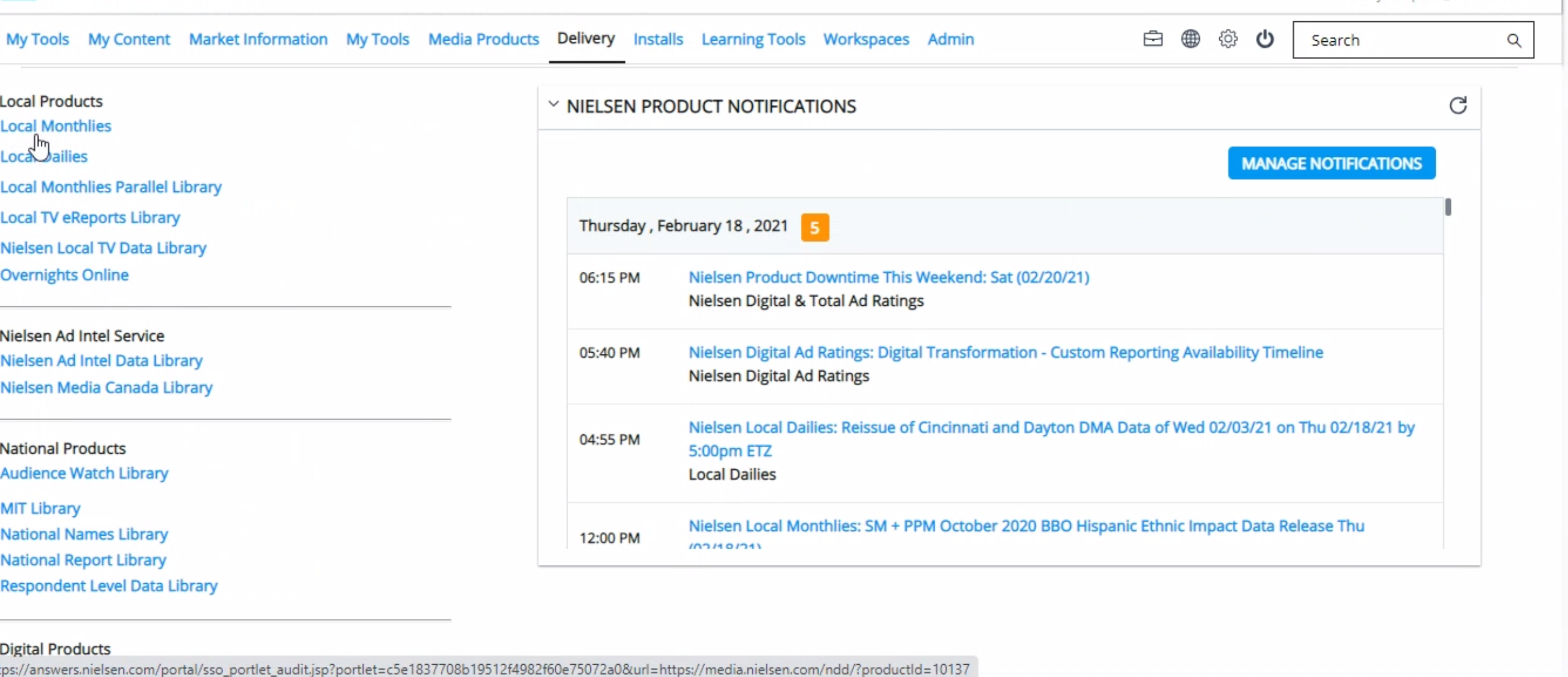
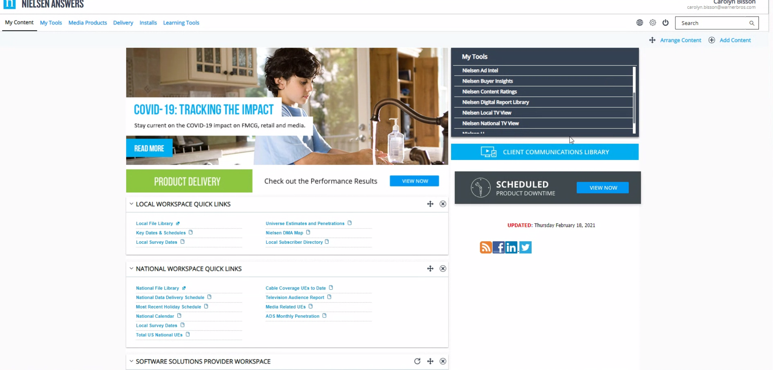
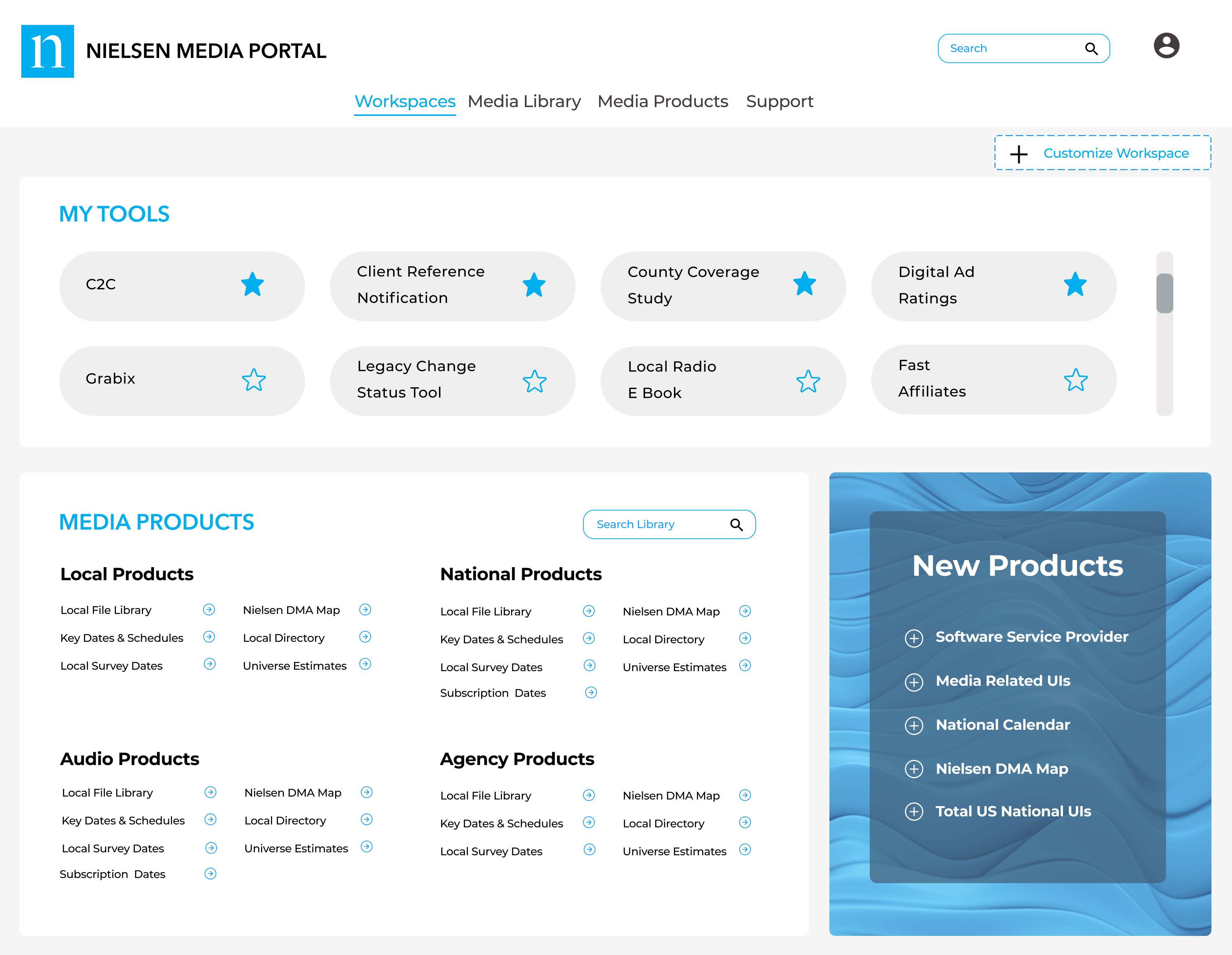
Current website: Unintuitive main navigation
An example of unintuitive navigation can be seen when the number of tabs in the main navigation changes after selecting the Delivery and My Content tabs. This creates a high cognitive and interaction load, leading to a significant drop in user engagement.
User testing
First round of testing showed improved interaction load
In the first round of user testing, we conducted five moderated interviews with Nielsen’s direct customers. We asked open-ended questions about how users perform their tasks, which parts of the website they use most, and how effectively the site supports their goals. We also measured task success score and compared the results to the new proposed Prototype 1.
At the end of the session, we asked participants if they would recommend both websites to a friend on a scale from 1 to 10. The current website scored 3, while our proposed prototype scored 8.
We continued this testing approach through the next four rounds, consistently improving the user experience, task success score, and net promoter score.
Current website
Design of prototype 1
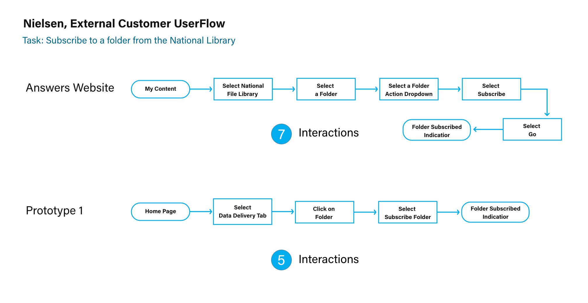
To reduce interaction load, I created user flows for both the current website and the proposed solution, demonstrating how the number of interaction steps was reduced from 7 to 5.
Final designs and prototype
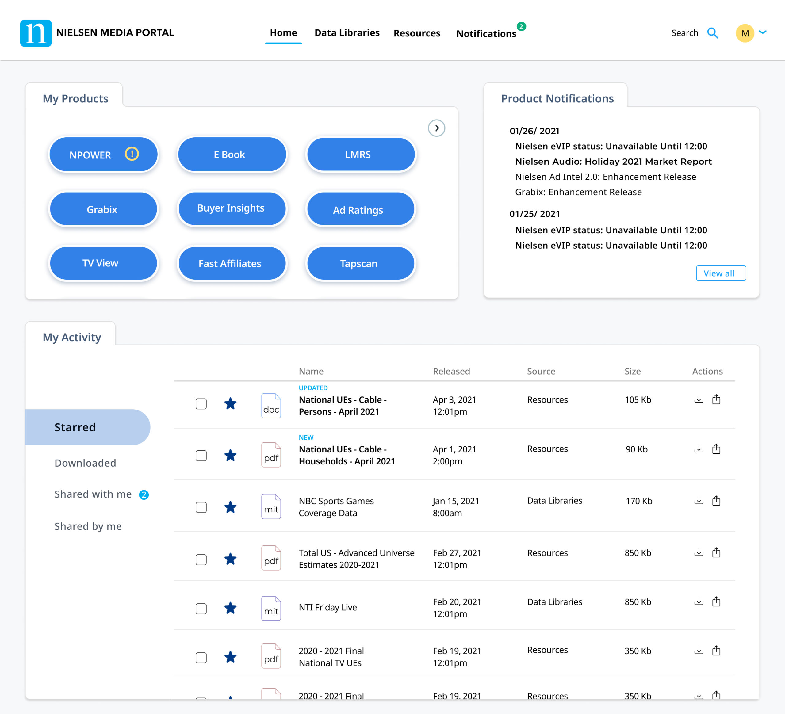
Main navigation was simplified for ease of use
The first and most important problem we concentrated on was redefining the information architecture and creating an updated site map utilizing a card-sorting technique. This effort resulted in a simple but effective main navigation comprised of Home, Data Libraries, Resources, Notifications, Search, and Profile.
With that, we cleaned up page clutter and improved the usability metrics of the interface almost immediately. We saw and measured improvement in the second user testing round.
Home page – user research showed that ‘My products’ needed customizability
During user interviews, we learned that 90% of users come to Nielsen Media Portal to use My Products. My products are data processing tools that. Therefore, I placed the ‘My Products’ widget in the top left corner to promote discoverability. But, since Nielsen has more than 150 products, users were pretty vocal about the fact that they only come to the Portal to work with 3 to 5 most used products from their company subscription list. Following that insight, I designed the ‘My Products’ widget to be customizable, so users can reorder their most used products based on their preferences.
Home page – we added a new sharing feature to the ‘My Activity’ widget
‘My Activity’ is a new proposed widget for Nielsen’s website. 88% of users come to the website to download, share, and view previously used documents. Their day-to-day workflows require quick access to Nielsen’s data for presentations, analysis, and compilation for future work.
Resources page was recreated to include filters for quick document search
Resources is a page where customers and Nielsen admins, can search and filter for documents that have been uploaded through the portal over the years. We added the ability for the users to share documents within their teams and company-wide with permissions. They can also star the most important documents that will then appear on the home page ‘My Activity’ section.
Data Libraries page was redesigned with a different set of filters
The Data Libraries page is a collection of all files that are related to data analysis. Here we created date-range filters, and this decision was based on how users thought of these data sets when searching. We also added the ability to cross-reference Local and National libraries and filter them by the time when they were created.
Admins page was streamlined to make adding new documents findable in the Recourses page
Nielsen admins can log in to the website and directly upload the documents requested by their clients through the Admin tab. On the Admin page, they can choose file type, content category, subcategory, and suggested keywords before they publish the document. They also have the option to add a keyword from a suggestion list or create a new keyword for easier searching.