Sharewaste
Mobile app redesign
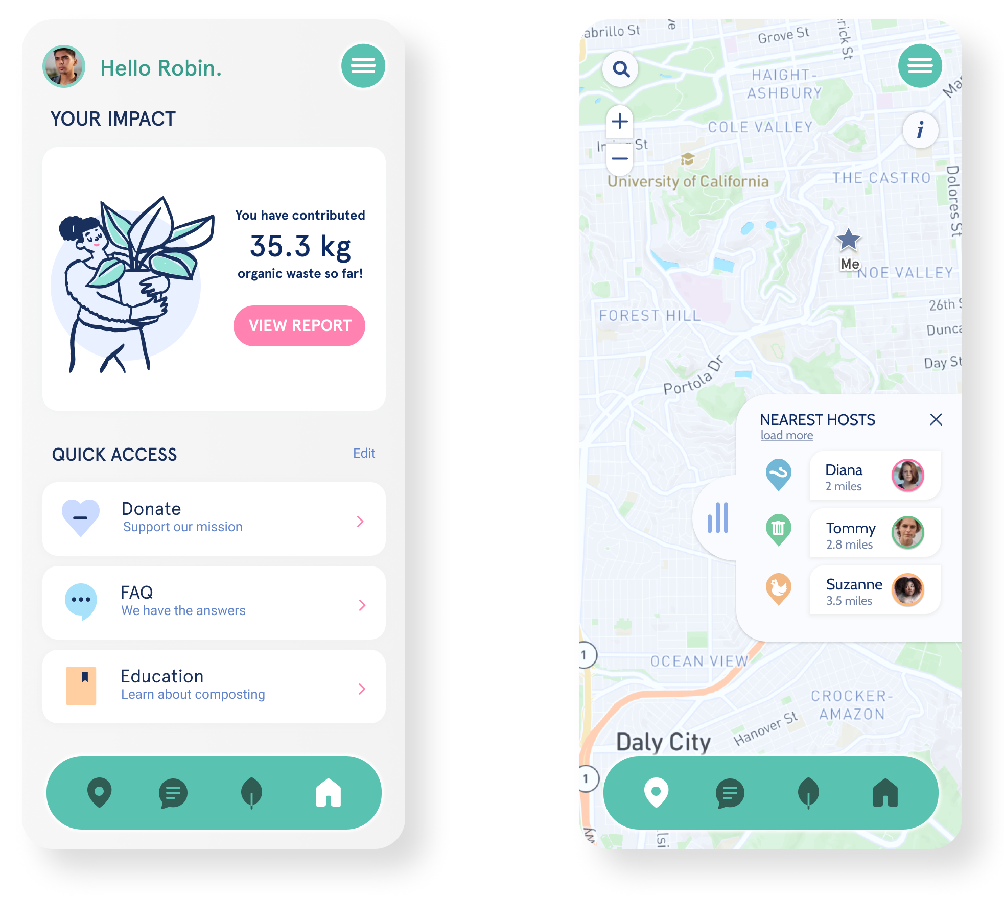
Overview
ShareWaste is a company that connects individuals passionate about composting within local communities. Donors use the app to find Hosts and contribute their food scraps to an existing compost pile, helping divert waste from landfills.
While the current ShareWaste app has a minimalistic design, it faces functionality issues and user roadblocks that hinder its effectiveness.
My role and impact
As the Lead Visual Interaction Designer, I identified usability issues through testing and developed intuitive, elegant solutions to address user problems. I fulfilled our vision through a well planned strategy that raised the success of the design and significantly improved the usability score.
Key Contributions: setting strategy, user testing, ideation, visual design, and interaction design.
Team
Three designers
Duration
3 Months (2020)
Software
Figma, Ilustrator,
Photoshop

The problem
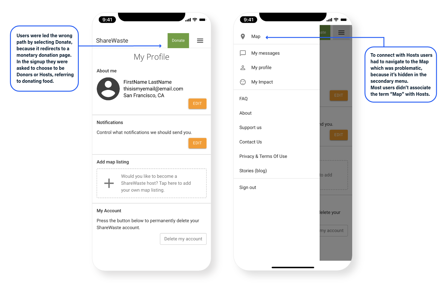
While the app provides a solid service, first-time users struggle with navigation, particularly in finding the map and locating Hosts. The terminology used is unclear — for example, Donors are users who contribute food scraps to a Host’s compost pile, but the main call-to-action on the page is “Donate,” which redirects users to a monetary donation page instead. Additionally, users can’t see nearby Hosts in remote areas on the map. All this creates confusion and abandonment in the flow.
Defining the scope
After conducting preliminary research and fast wireframing, we defined our scope in two phases:
Phase 1
- Test and iterate, remove user roadblocks to ensure a seamless flow
- Create an intuitive user experience, rebrand the app, maintaining a minimalistic yet contemporary look
- Build the Onboarding flow
- Develop a calendar feature for scheduling
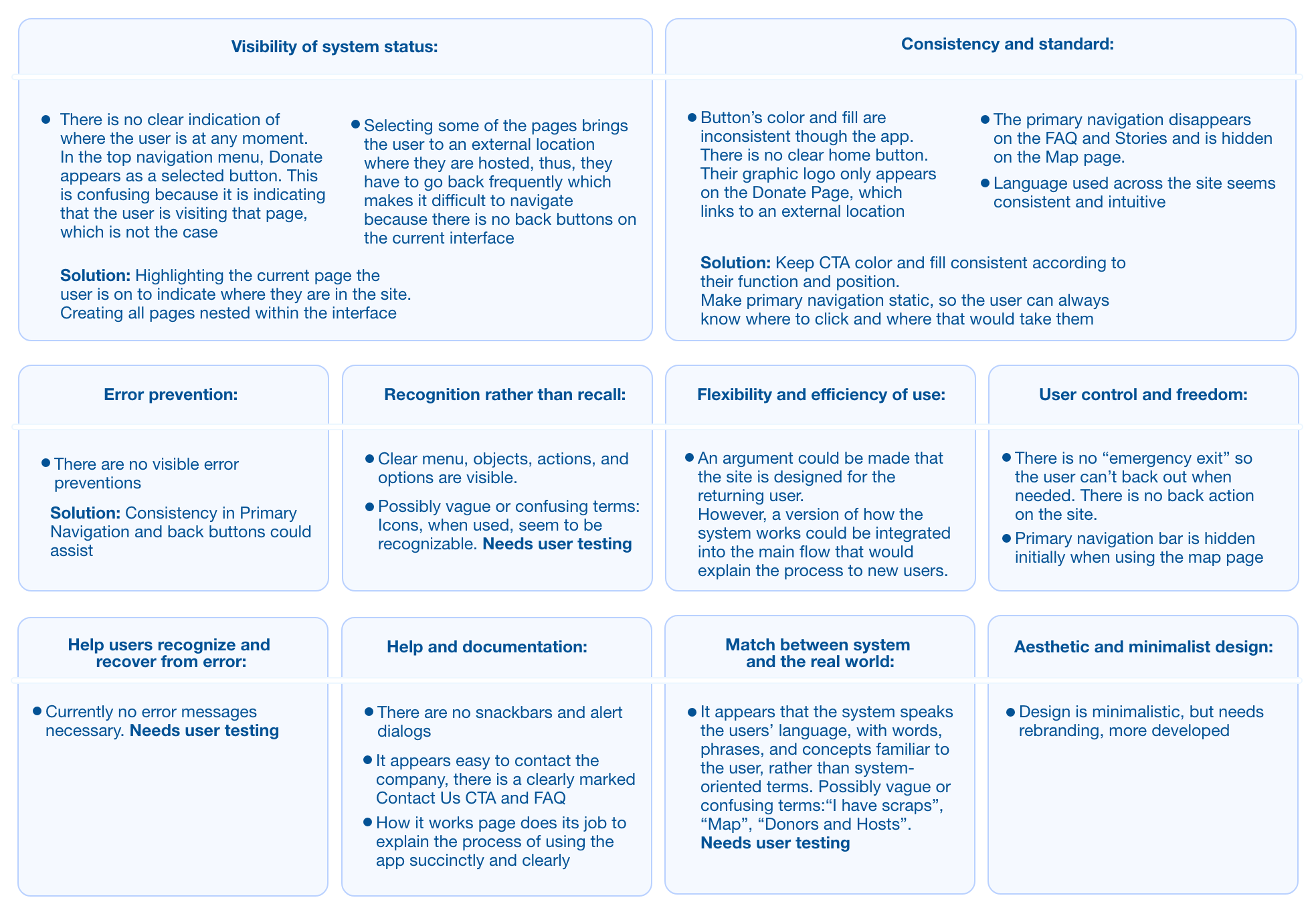
Heuristic Analysis was later confirmed by user testing
To kick start this project I performed a Heuristic Analysis based on Nielsen Norman’s ten heuristic principles.
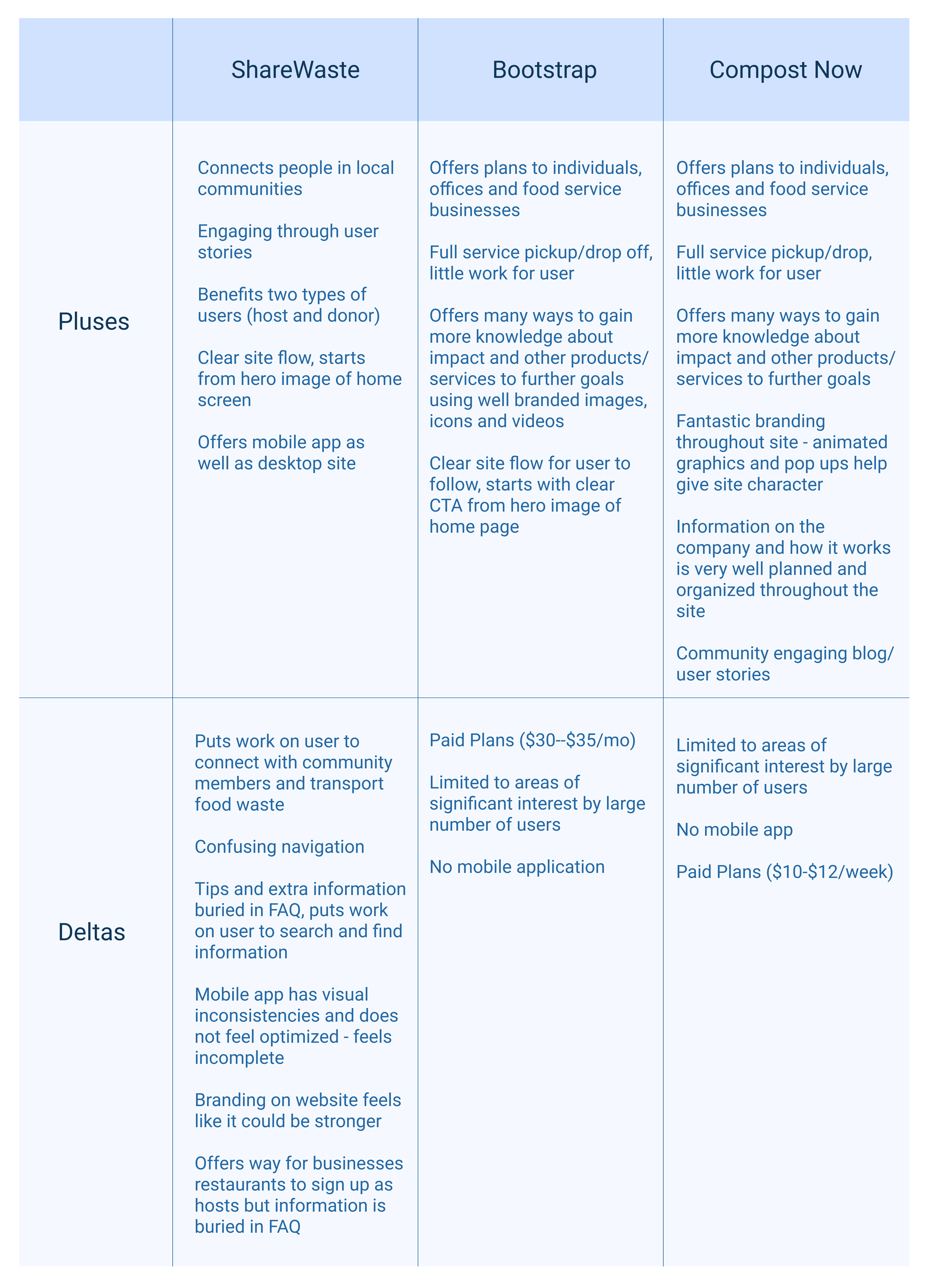
Looking at other competitors I created a Comparative Analysis, using pluses and deltas.
Repetitive user testing as the basis for our design decisions
User testing identified several roadblocks and pain points. After conducting moderated user testing with a mockup of the current ShareWaste app and observing the user paths, I created a questionnaire to measure various metrics, including task success, net promoter score, and emotional tracking.
Current ShareWaste app
The proposed solution showed improved user experience
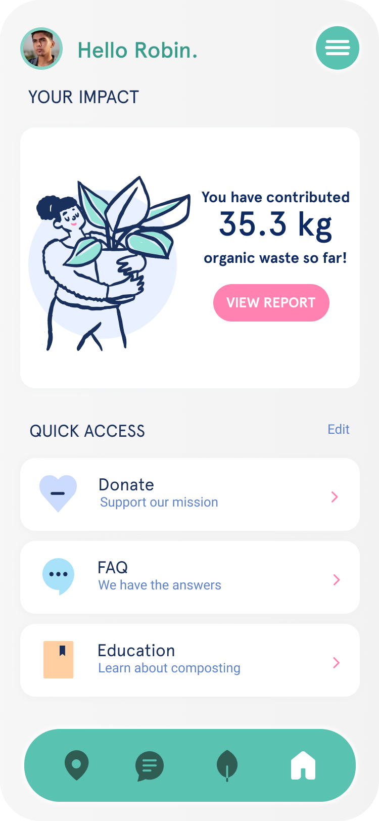
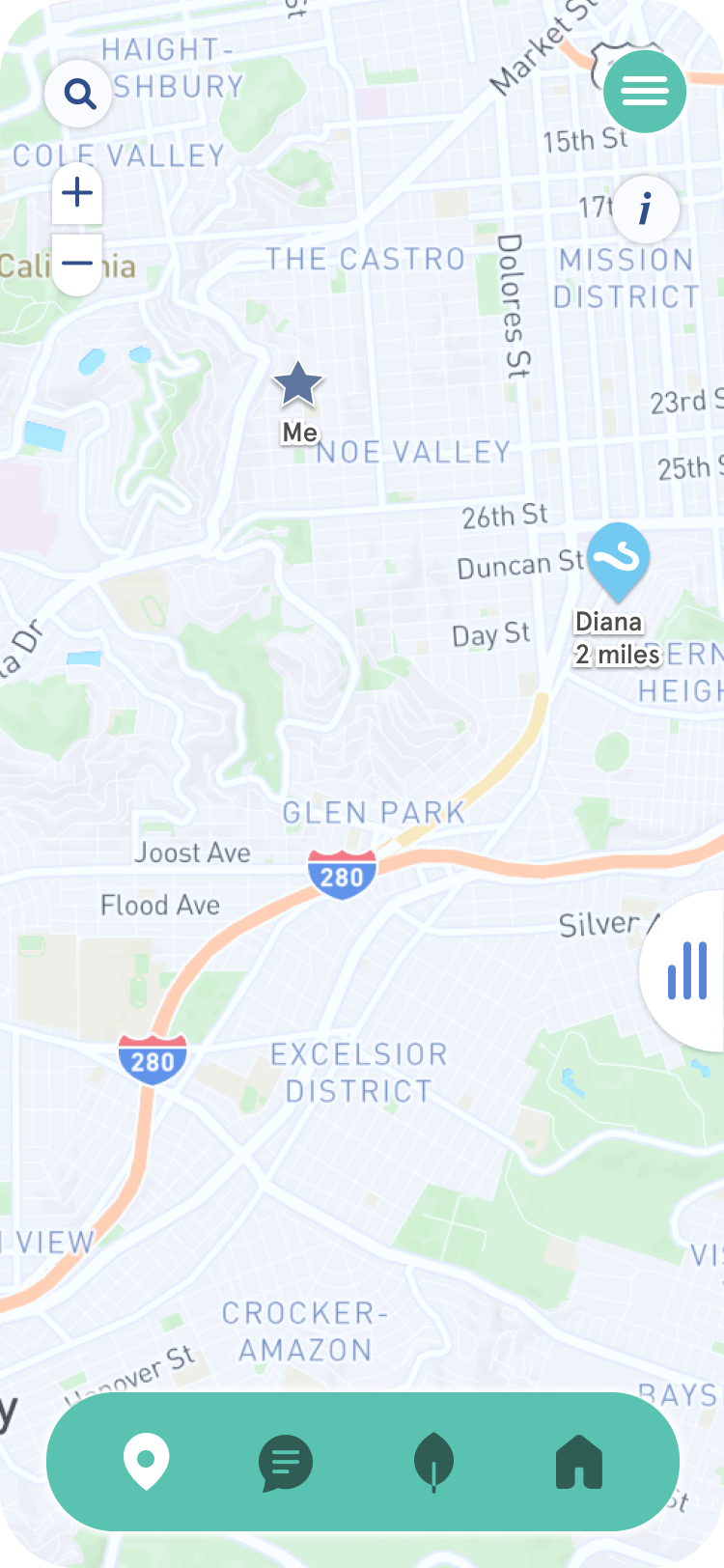
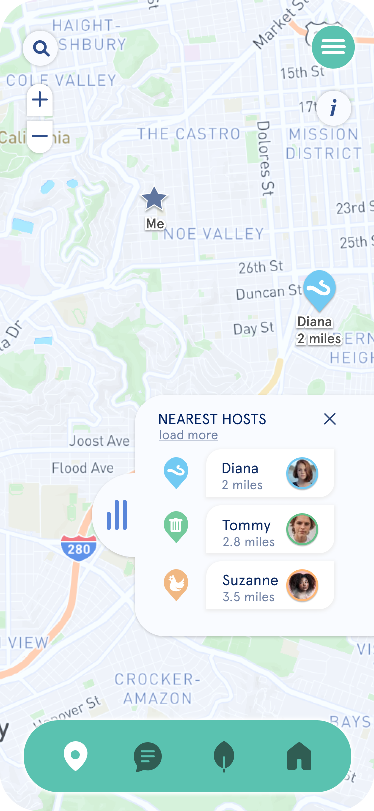
Based on insights from the first round of testing, I created a grayscale prototype featuring a revamped onboarding flow with micro animations, new sign-up screens, a streamlined homepage with quick links, enhanced map functionality, and a list of nearby Composters. The prototype was tested again, showing significant improvements in the user experience.
V1 Prototype
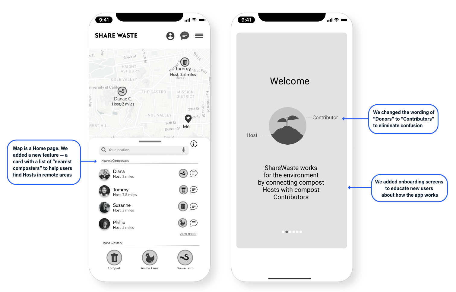
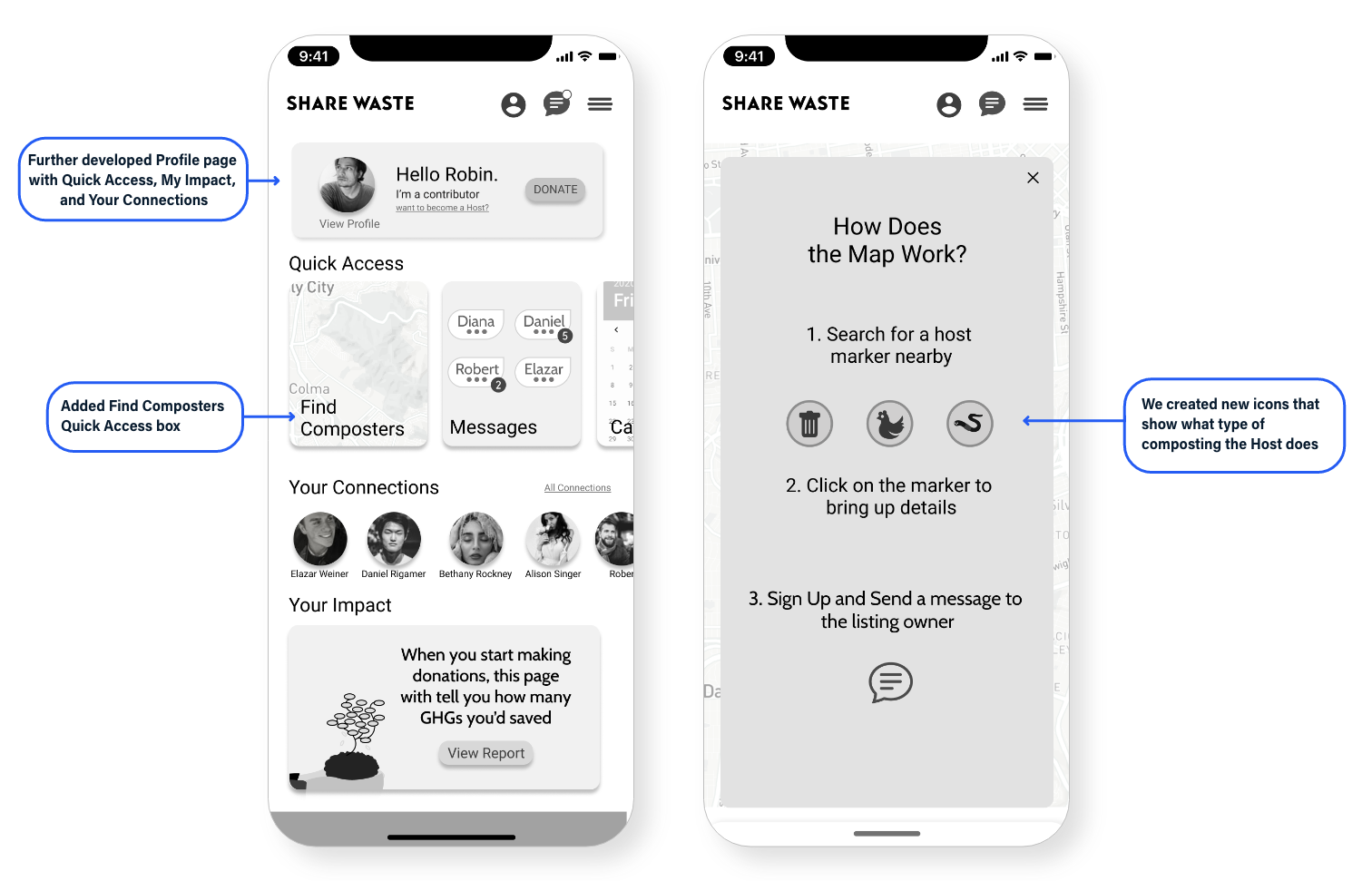
How did the ShareWaste app did against the new solution?
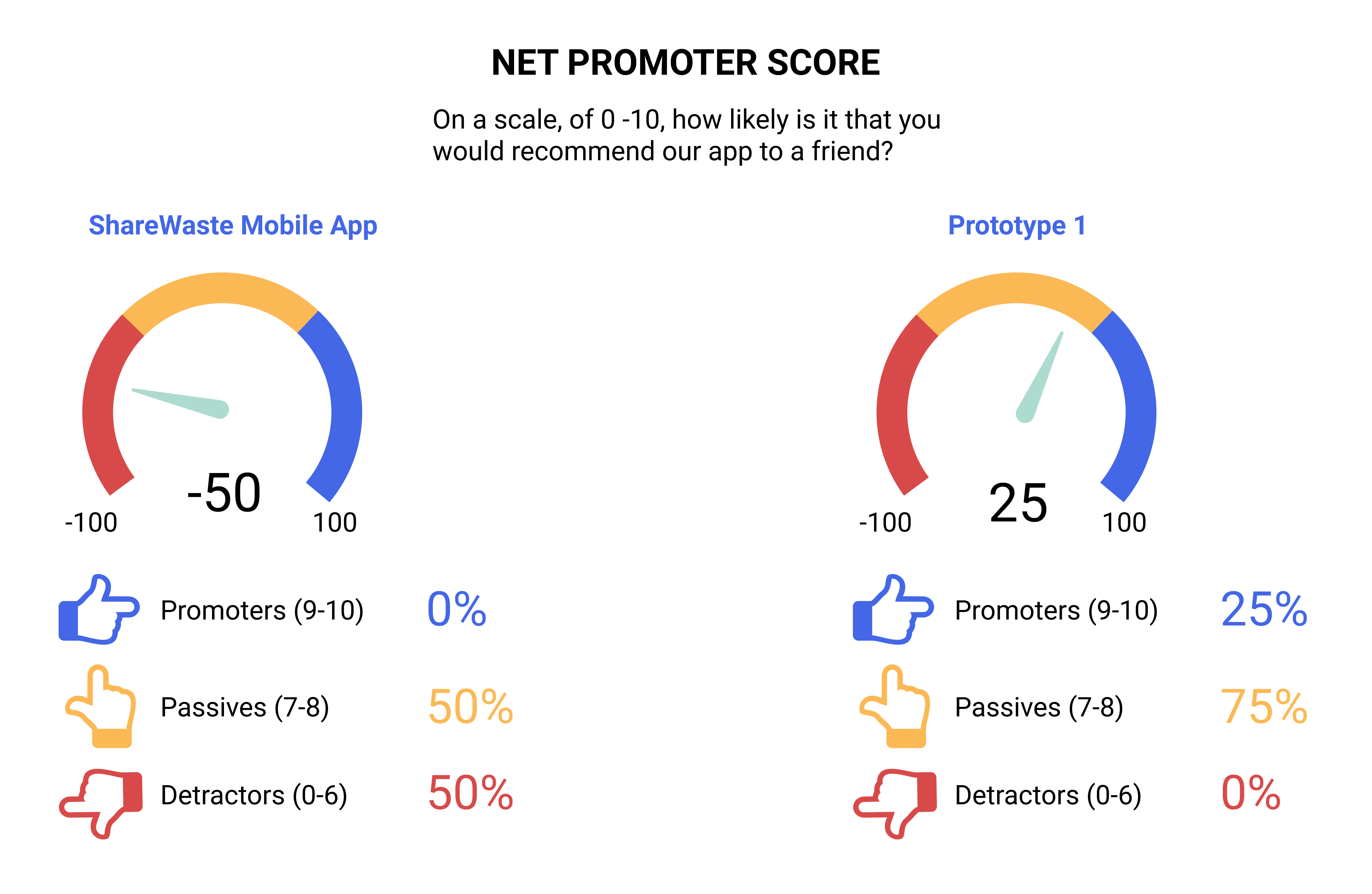
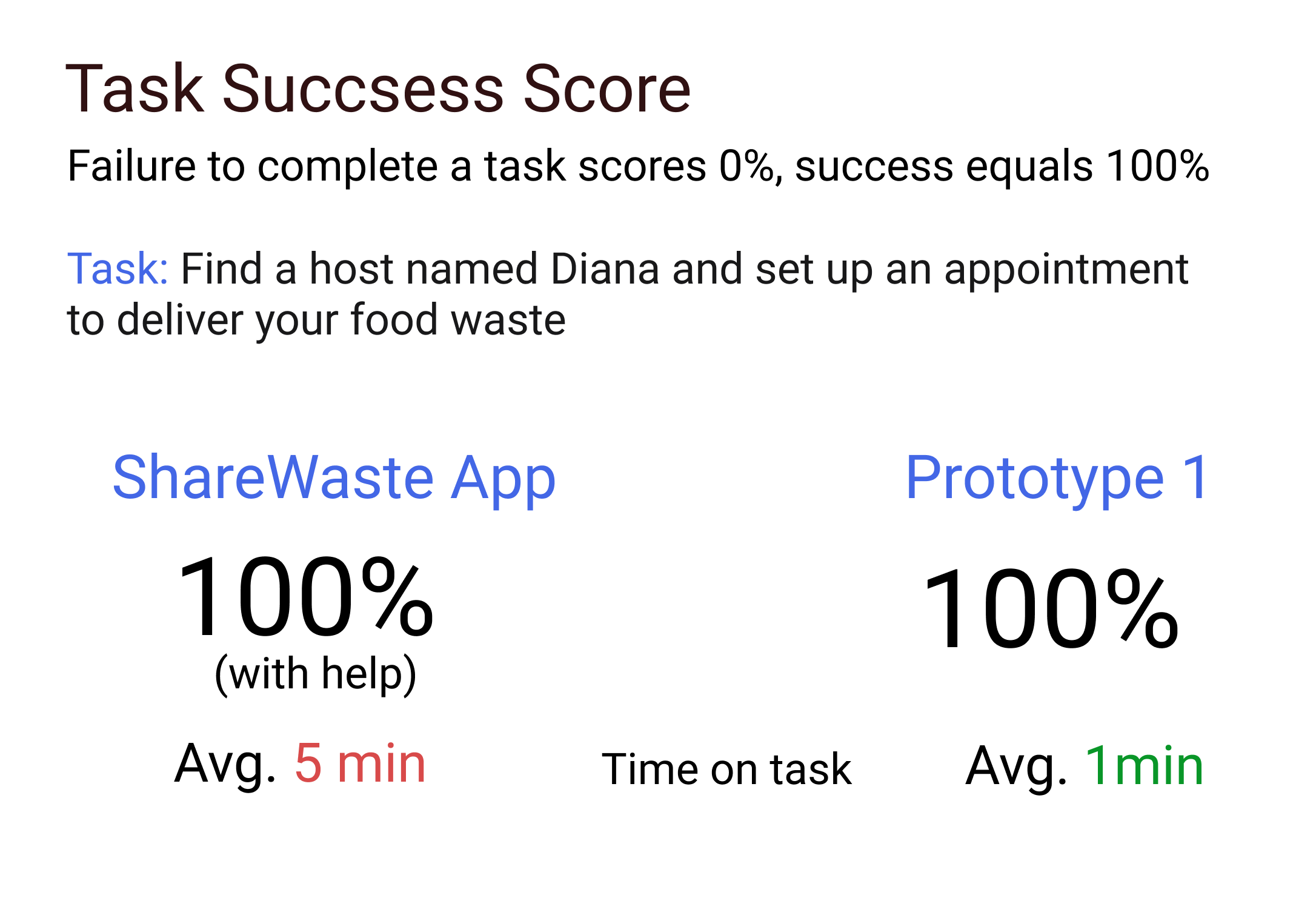
Below are summarized results of both user studies, where I compared the experience of the current ShareWaste app to the new solution in Prototype 1.
I conducted customer satisfaction and usability studies shared bellow.
Color, UI, motion and micro-interactions
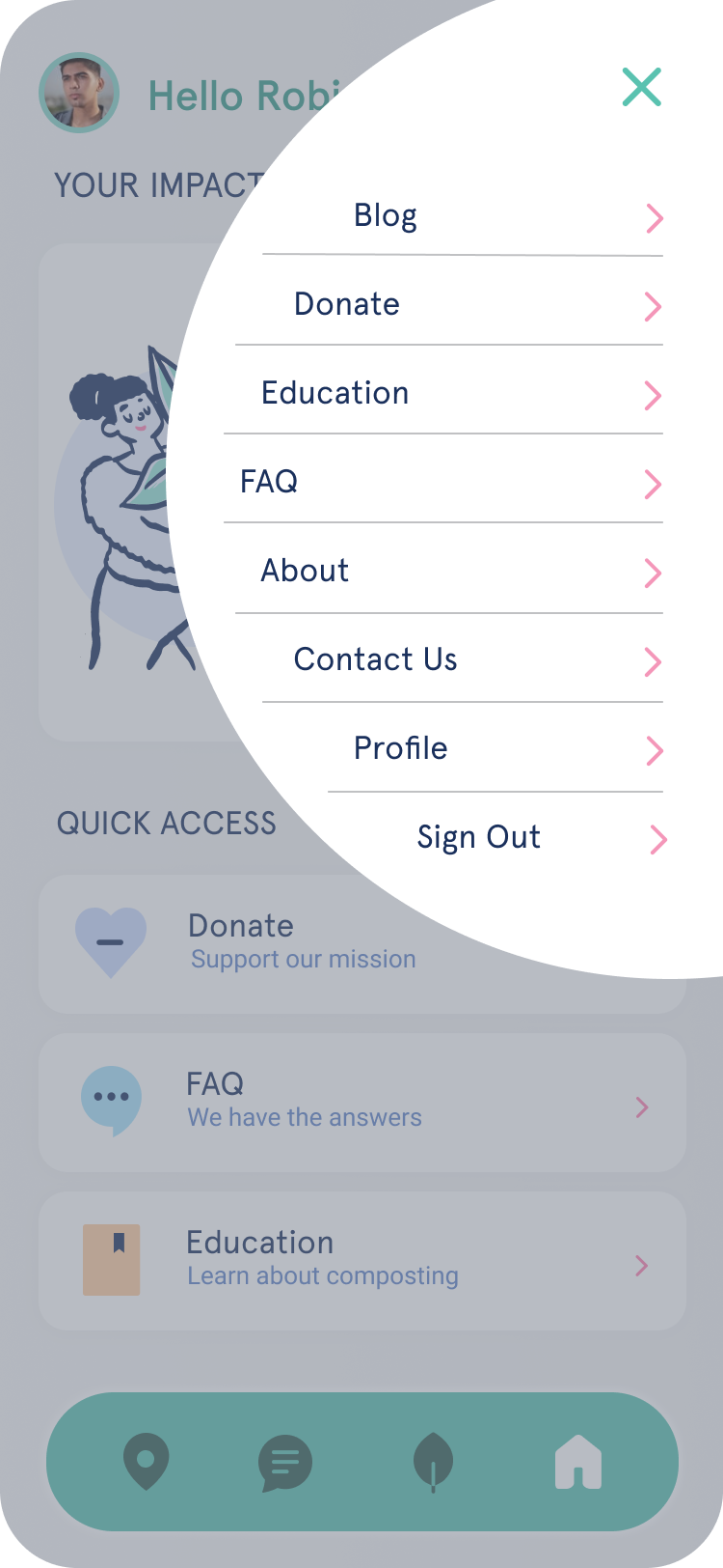
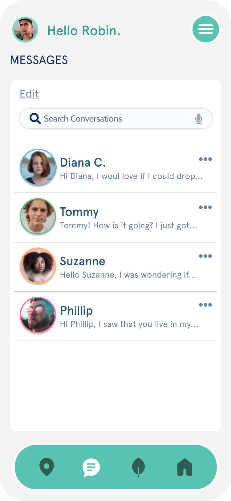
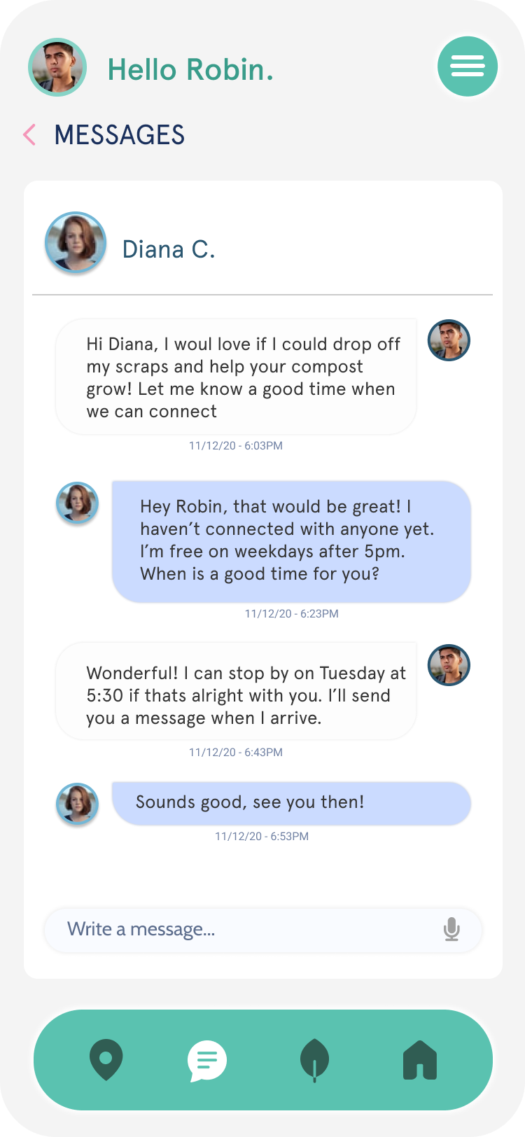
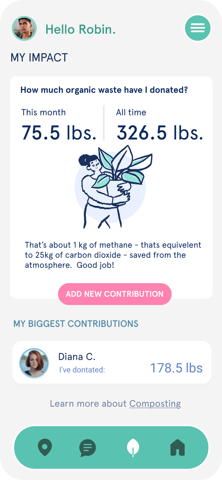
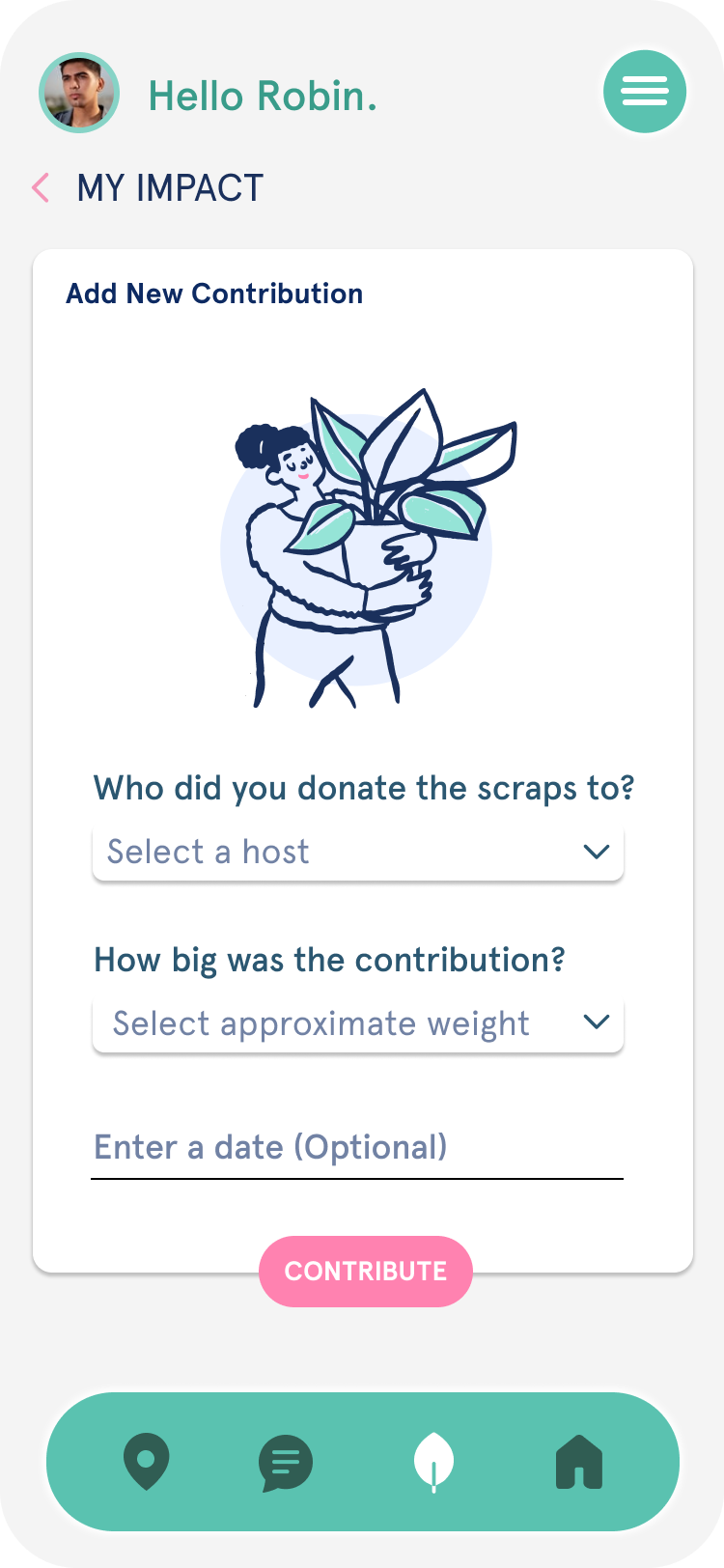
After analyzing the second round of usability test results and addressing key roadblocks, I focused on refining micro-interactions, perfecting UI elements, and enhancing the overall visual flow of the app.
V2 Prototype
