Zero
E-commerce web design
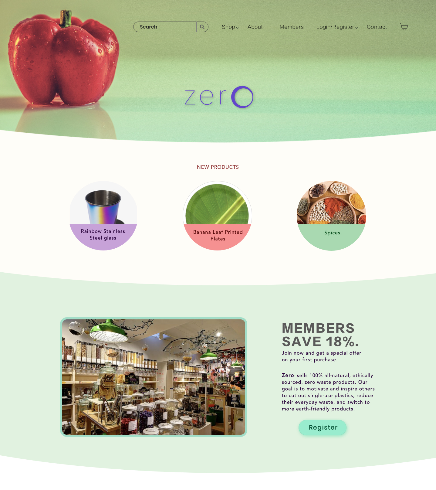
The brief
“A suburban store located at the heart of city it has always been adaptive to the needs of a growing community. To date, 95% of all sales are made through patronage at the store’s physical location. The owner has hired you to create an improved eCommerce website.“
My role and responsibilities
As a solo UX Designer, I was tasked with creating an organized, intuitive online store for two different customer groups — common and business users. I used research to discover user needs and pinpoint the most pressing problem. I ideated possible solutions, conducted user testing, and iterated the design until ready for delivery.
Team
Solo designer
Duration
4 weeks (2020)
Software
Sketch, InVison Studio,
Photoshop

Who are the users?
I began the research by conducting users interviews, because I wanted to discover who
are the users and what are their thoughts on the zero-waste shopping experience.
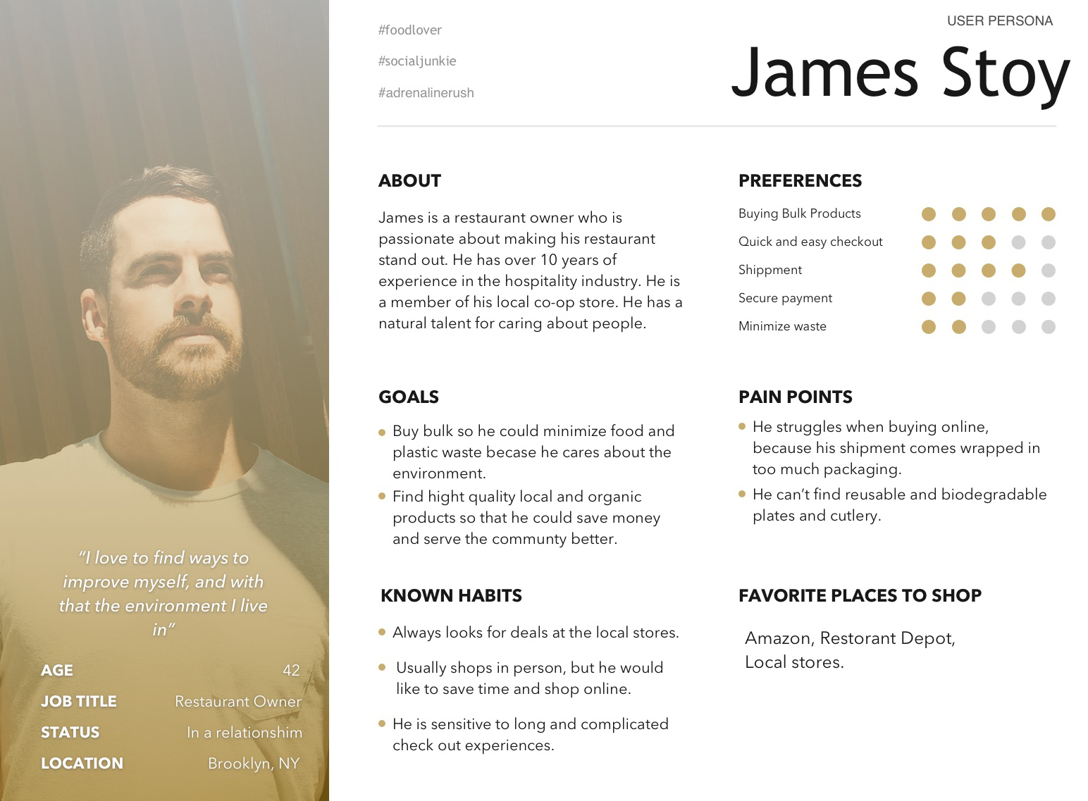
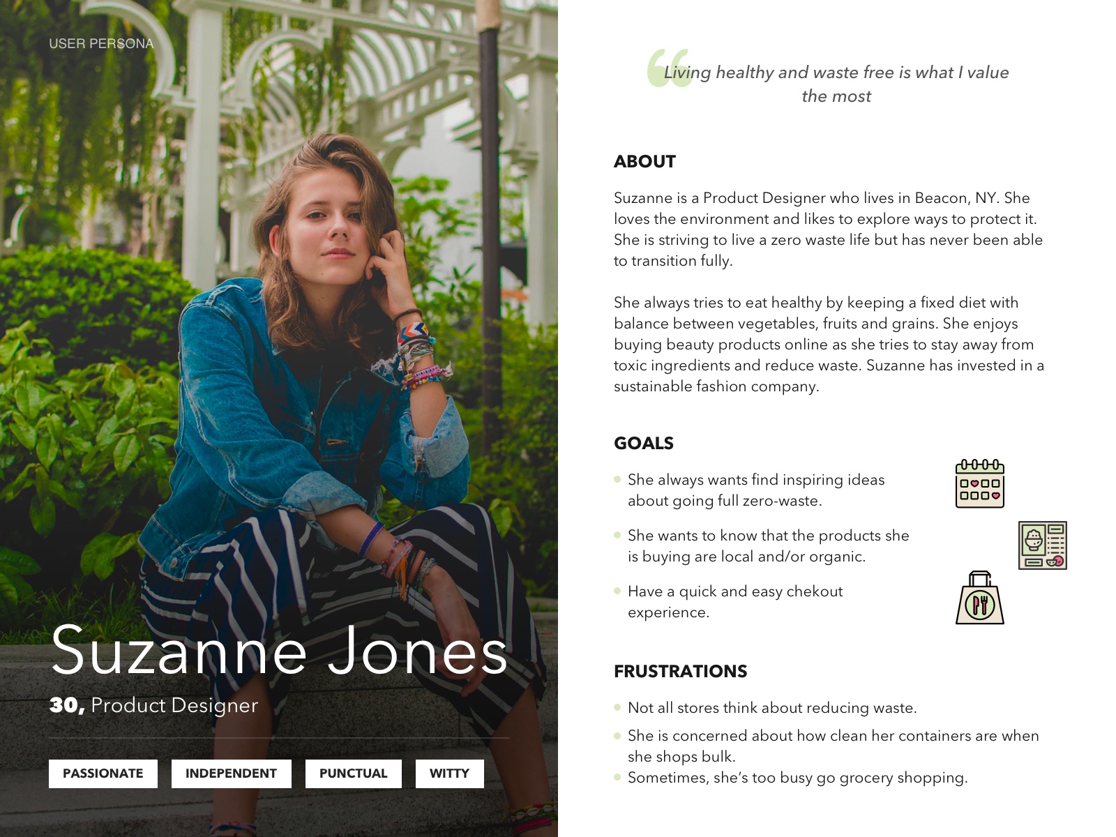
Based on the data collected from the research I’ve created two personas — James the
Business user (member account) and Suzanne the Common user:
• They both like to buy bulk, just in different quantities.
• Both are annoyed by how much plastic packaging, or even cardboard there is in shipments.
• Both like to buy locally sourced food, and are looking for an easy checkout experience.
• James orders his bulk products by phone, and Suzanne brings empty jars every time
she goes shopping.
Discovery of the problem through trends
To discover the problem, I grouped my observations from the user interviews into strongest trends
using Affinity mapping:
Packaging/Waste:
12 out of 12 users wanted products made of reusable, durable, and compostable materials. They were annoyed how much waste is produced by consumerism.
Shipping:
10 out of 12 users return their reusable containers through online shipping, and bring empty containers to the stores. Many of them didn’t like the effort it takes to do so.
Values/Beliefs:
8 out of 12 users choose the zero stores because they offer value, quality and bulk shopping. Users like that they are focused on the environment vs. advertising.
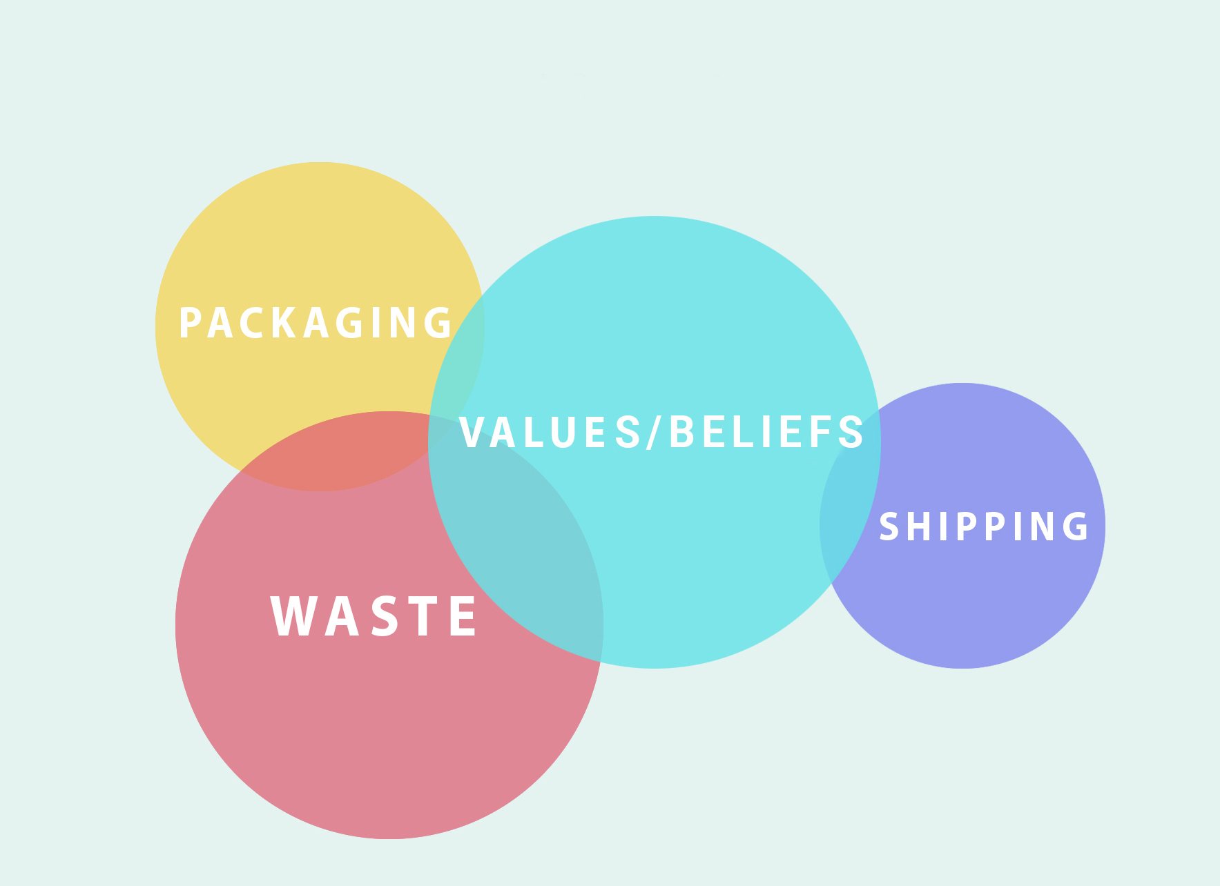
On further inspection, I looked at these trends and the relationship between them. What I found out is that all of these trends are connected, and the solution, would have to involve all of them in order to work. In this case the solution is partly digital and it lives in the real world.
Problem Statment
Users want to buy zero-waste products online and return containers efficiently, because for most of them returning reusables to the stores is difficult considering their busy lives.
Hypothesis
We believe that by creating an eCommerce website that offers a local delivery/pick up option all in one, we will help customers minimize waste and save time.
Solution Reqirenments
Create an on brand, functional website that sells variety of zero-waste products, has an easy checkout process, and offers a free delivery/pick up service.
From card sorting to information architecture
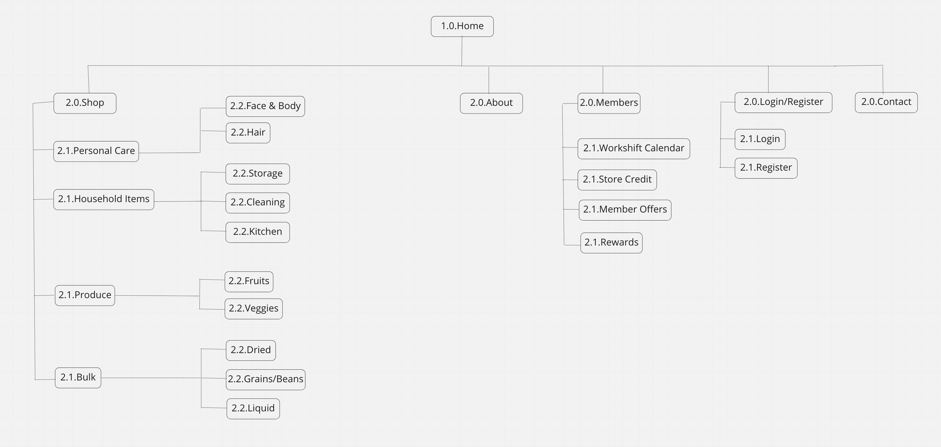
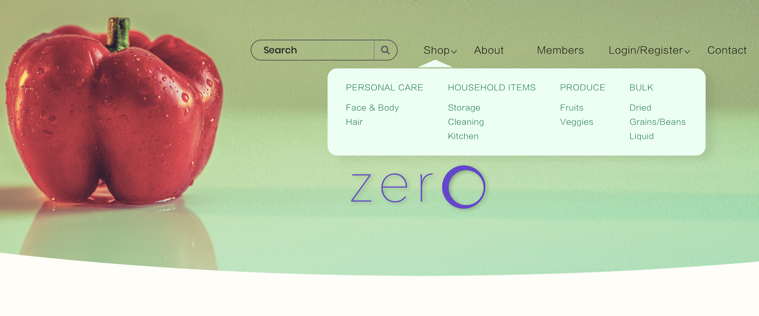
To organize the navigation I conducted an open cart sorting activity that included 10 people and 75 different products. Which I used to find out which categories repeat the most. Below are the Site Map and the Navigation Bar, that came as a result of the activity:
Analyzing tasks in a competitive analysis
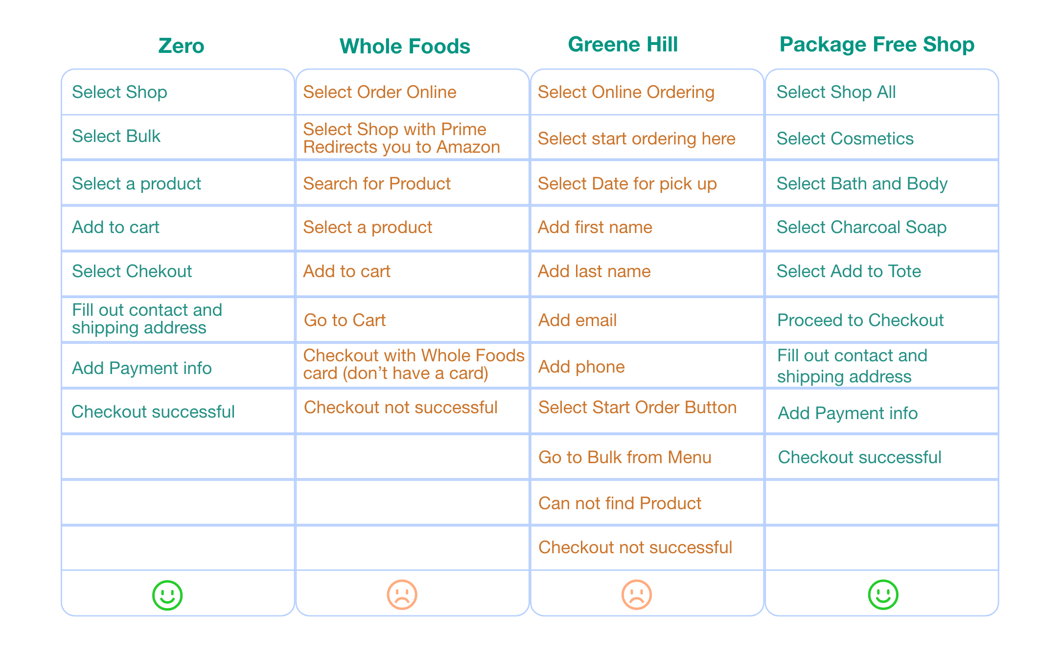
Next I wanted to look at companies that support the zero waste movement, and see how their online experience compares. Below is a graph that contains a task analysis comparison for our store Zero, Whole Foods, Green Hill Store, Package Free Shop. The task was to order a product online and compare how intuitive each checkout flow is.
Summary:
Whole foods: had fewer steps in the checkout process, but there are
no bulk products available.
Green Hill: I couldn’t find rice products, because there is no search bar.
Package Free Shop: checkout was intuitive.
Zero: has intuitive checkout and the least amount of steps.
The solution is partly digital — it lives in the real world
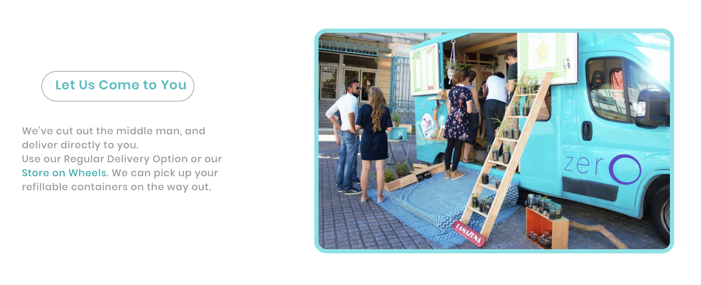
For the solution, I decided to add a free delivery/pick-up option in the checkout flow of the website.
• Regular delivery — a car that delivers orders, and picks up empty containers on the way back.
• Store on wheels — a wan that goes to customers’ homes to deliver online orders, pick up empty
reusables if they have any, while allowing customers to browse new products from the comfort
of their front porch.

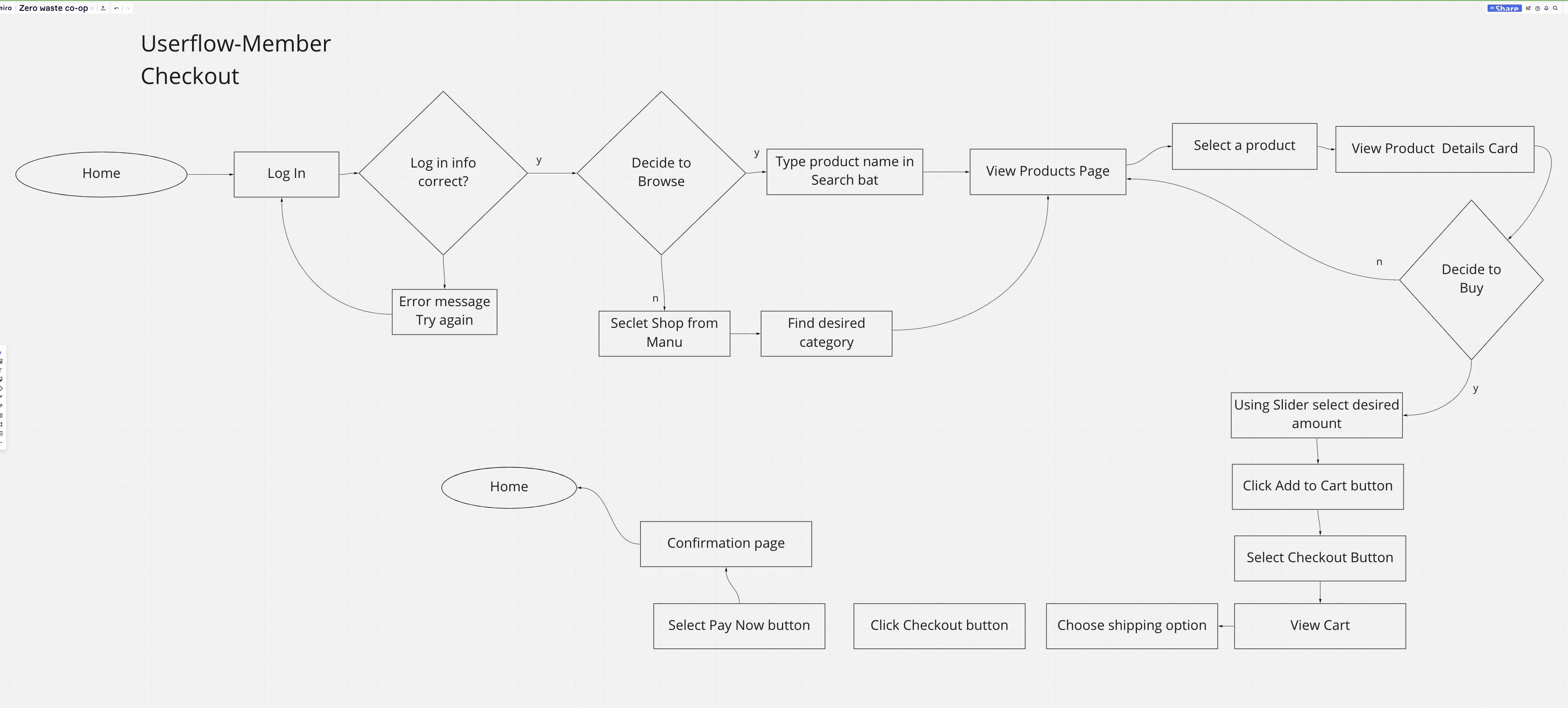
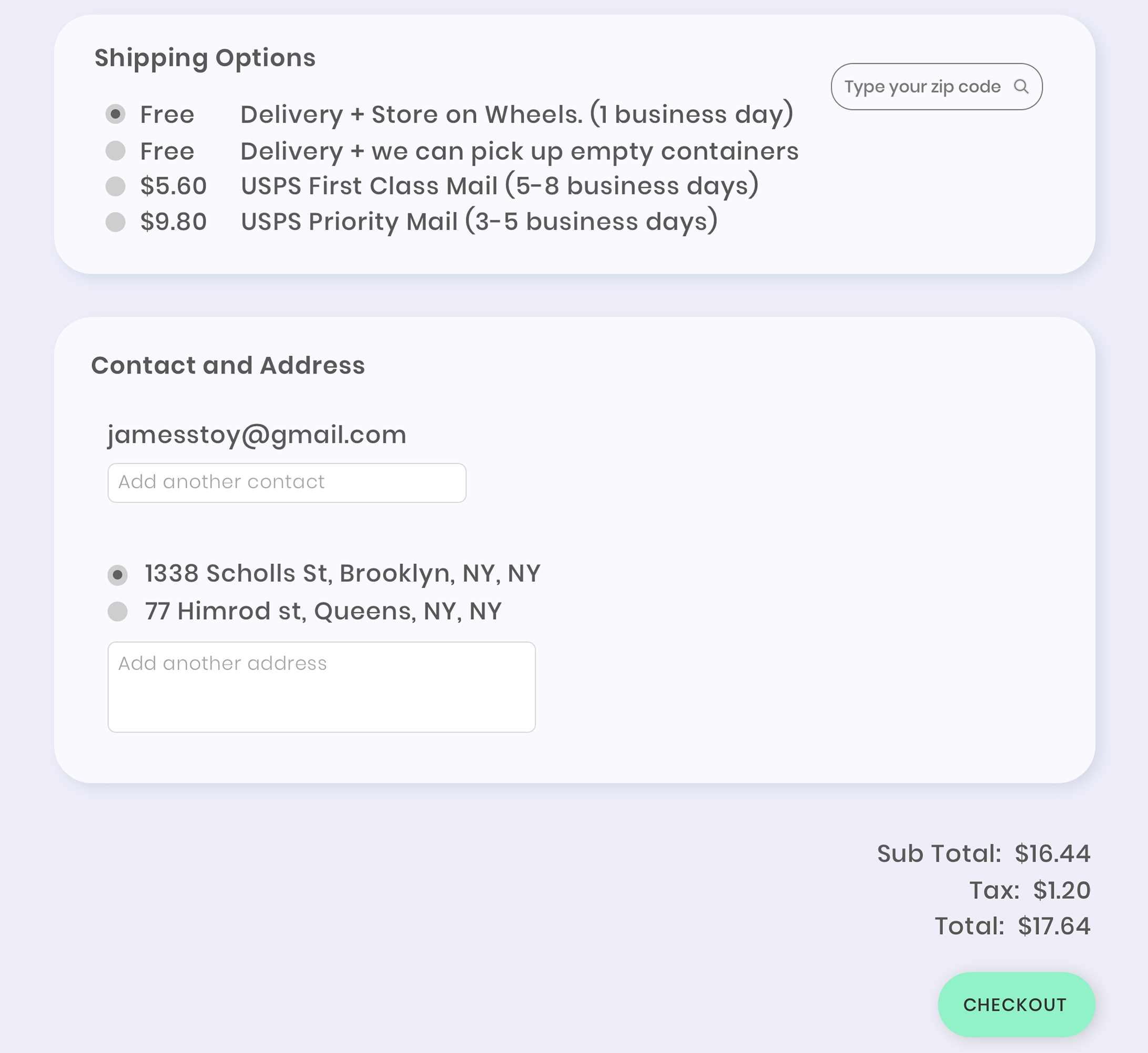
This is how the checkout flow looks like for the business user:
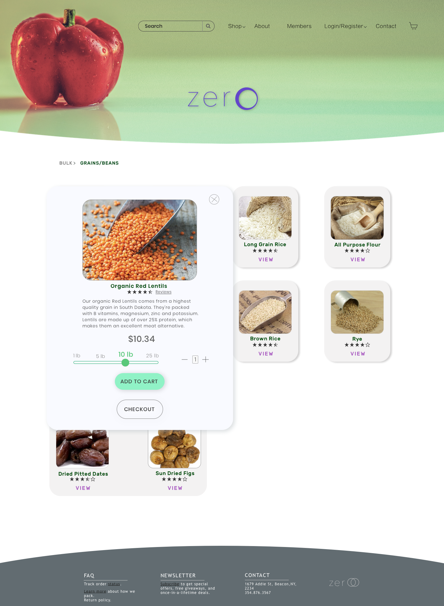
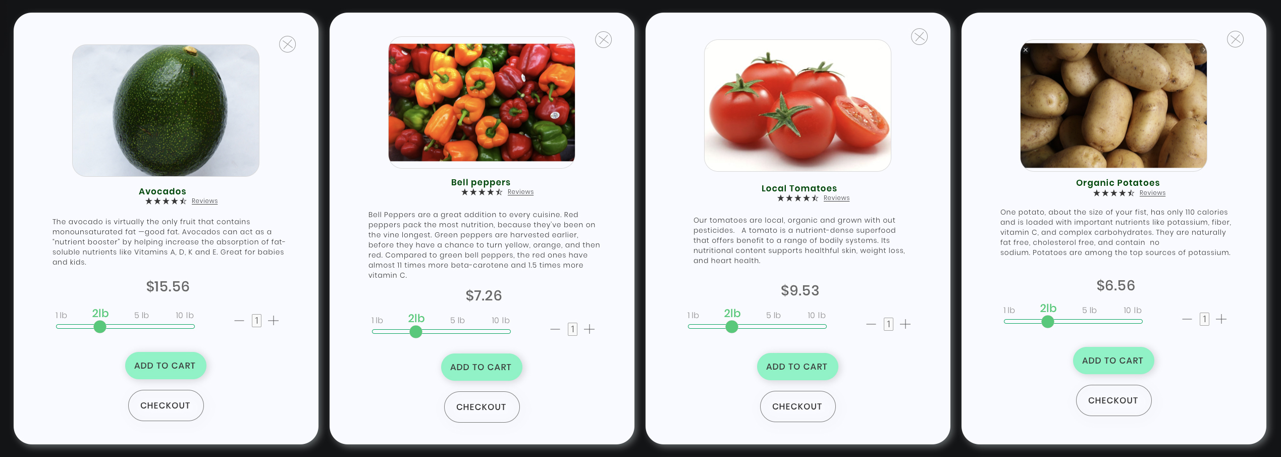
Product pages design
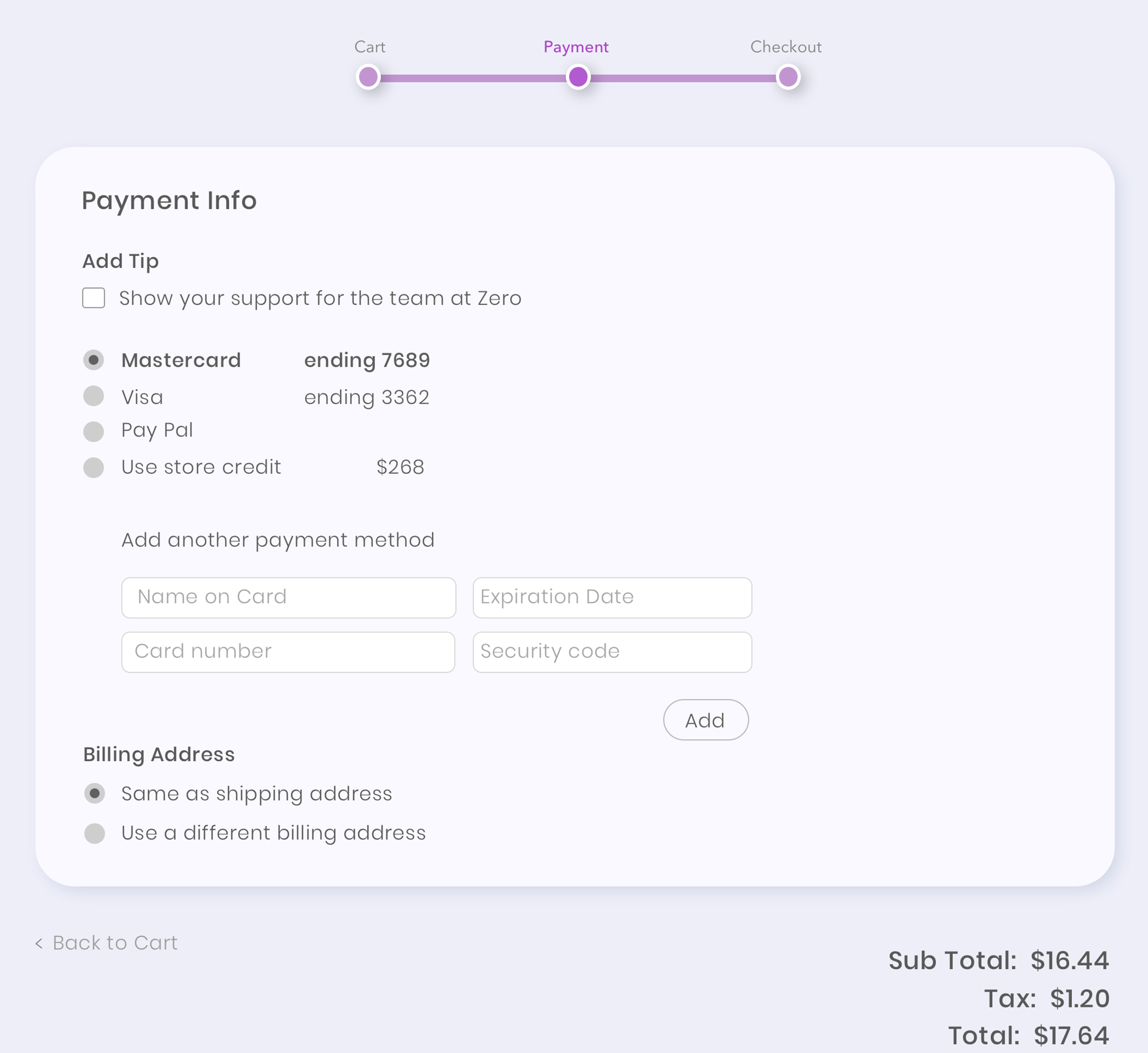
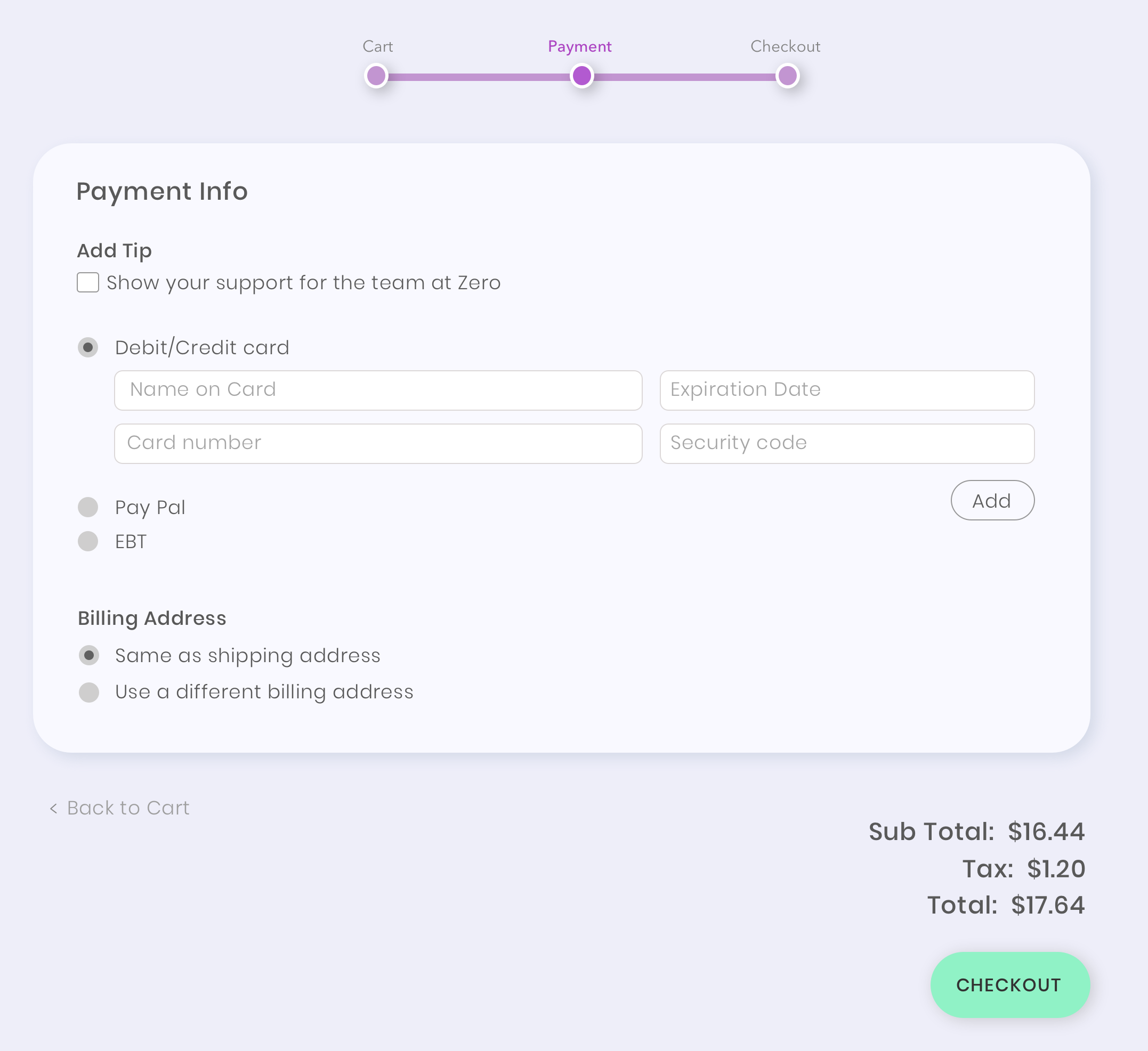
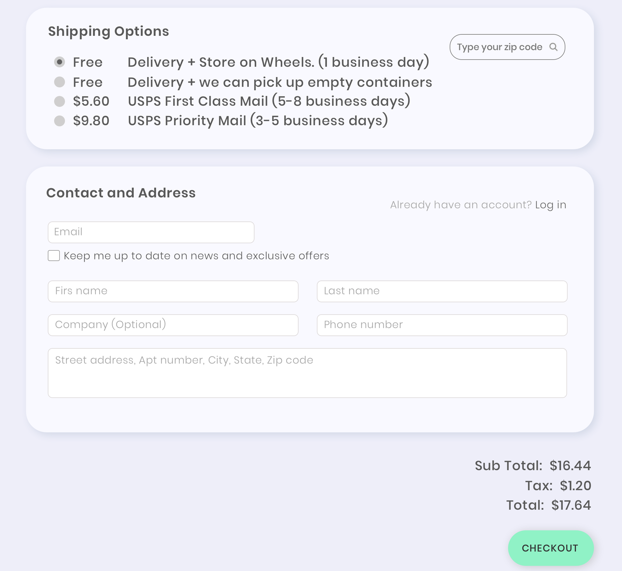
Below are payment and contact forms, as seen from the business and the common user’ perspective:


Prototype stages
I created the first prototype in grayscale because I wanted to make sure it functions well before I added colors and UI elements.
