Zoom
Adding a new feature
The problem
Zoom has become the standard service for online video meetings, and many people rely on its service daily. Our research revealed that users are unaware of the additional features that Zoom has to offer.
Therefore, users need an easy and intuitive way to access the features already available to them.
My role and responsibilities
In a team of five, as a UX/Visual Interaction Designer, I was tasked with adding a new drag and drop feature to the existing interface, that matches Zoom’s brand guidelines.
Key contributions: User interviews, Concept creation, Visual design, Interaction design, Affinity mapping, User flows, Site map, Wireframing, Prototyping.
Team
Four teammates
Duration
6 weeks (2020)
Software
Adobe XD, Photoshop

User interviews revealed a hidden trend
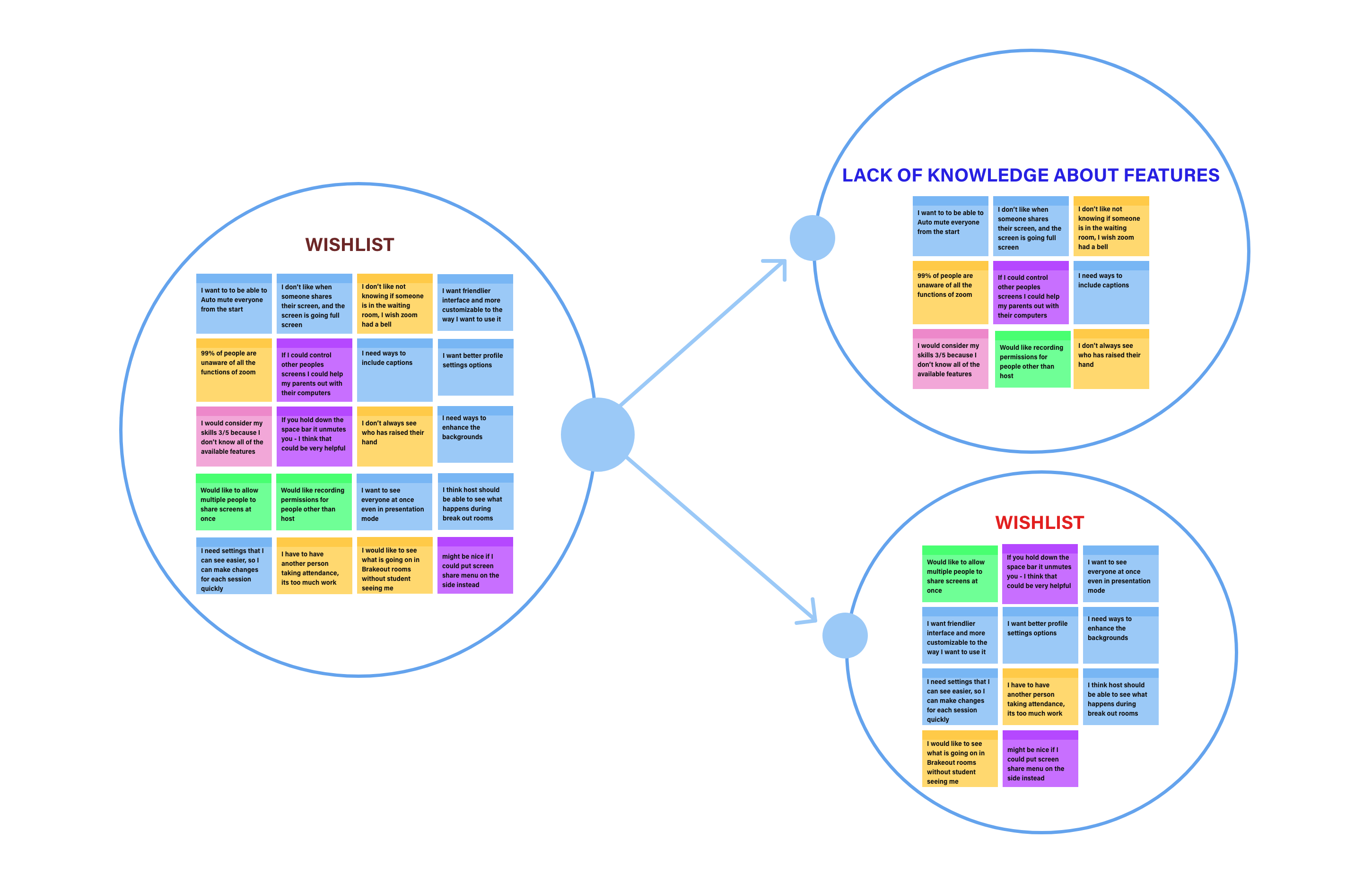
Based on the data collected from interviews and surveys, I created an affinity map board, in which a strong trend appeared. I noticed that in the wishlist group there were a significant number of requests about features that already exist in Zoom that users were unaware of.
The persona and their pain points using Zoom
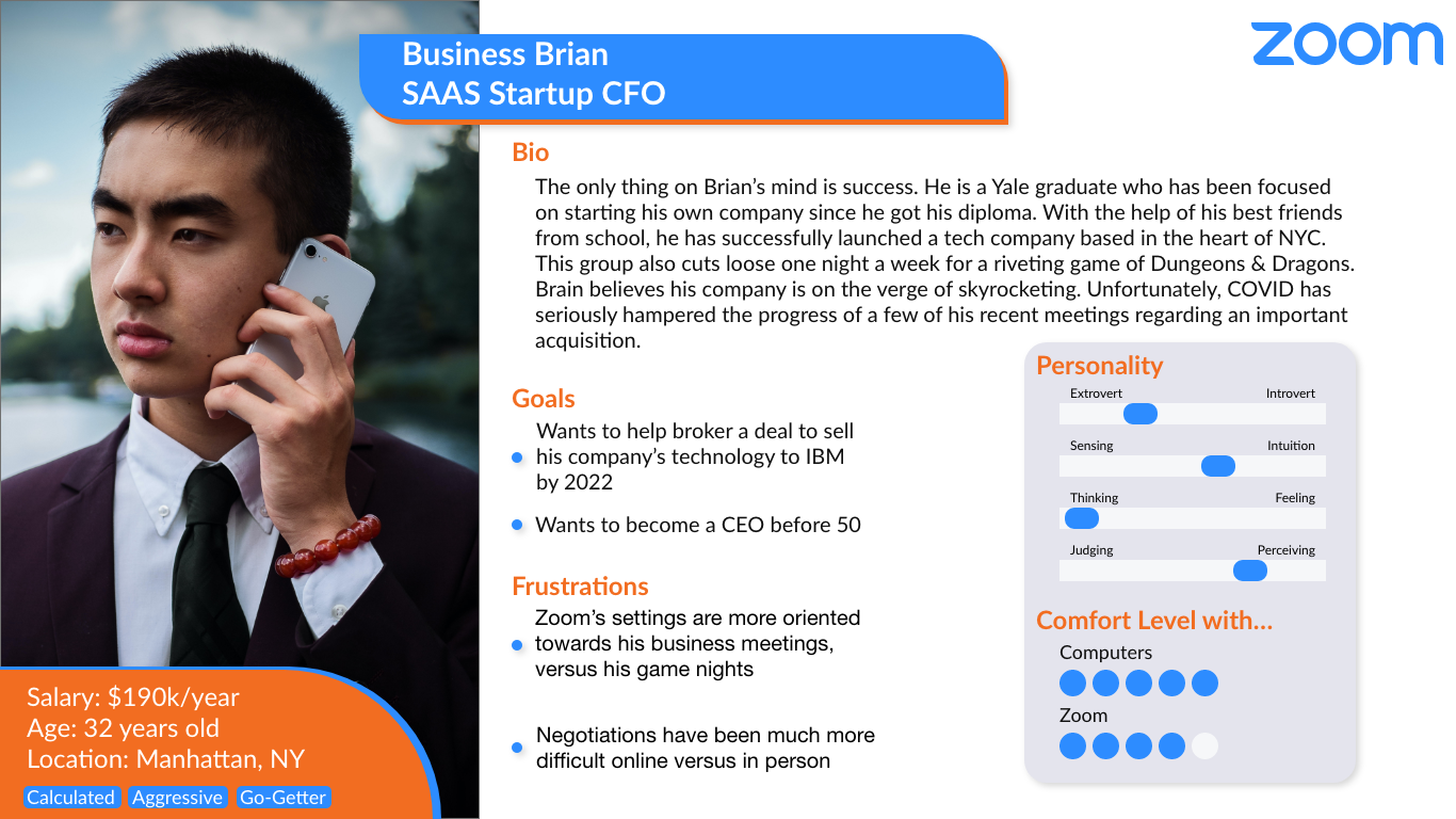
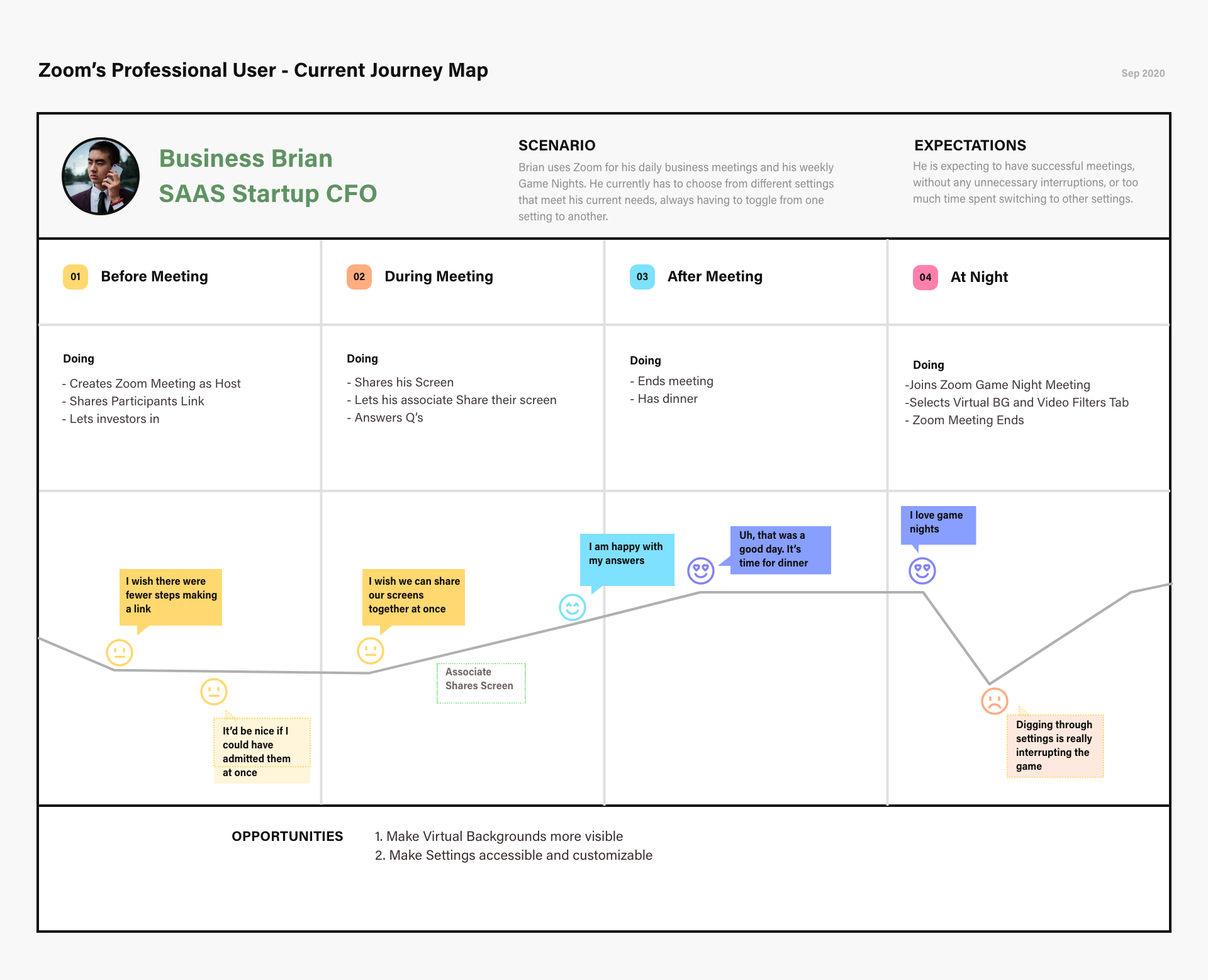
Based on the data collected from user interviews, this is how we synthesized our Persona: Brian is a business owner, he currently uses Zoom in two ways —for his work meetings, when he needs some of the basic features Zoom offers, and to meet with his friends on a game night when he likes to use virtual backgrounds and video filters. His biggest pain point is him trying to dig through layers of settings to get to the desired destination. This is visualized in the Journey map bellow.
Competitive analysis and the search for customization of features
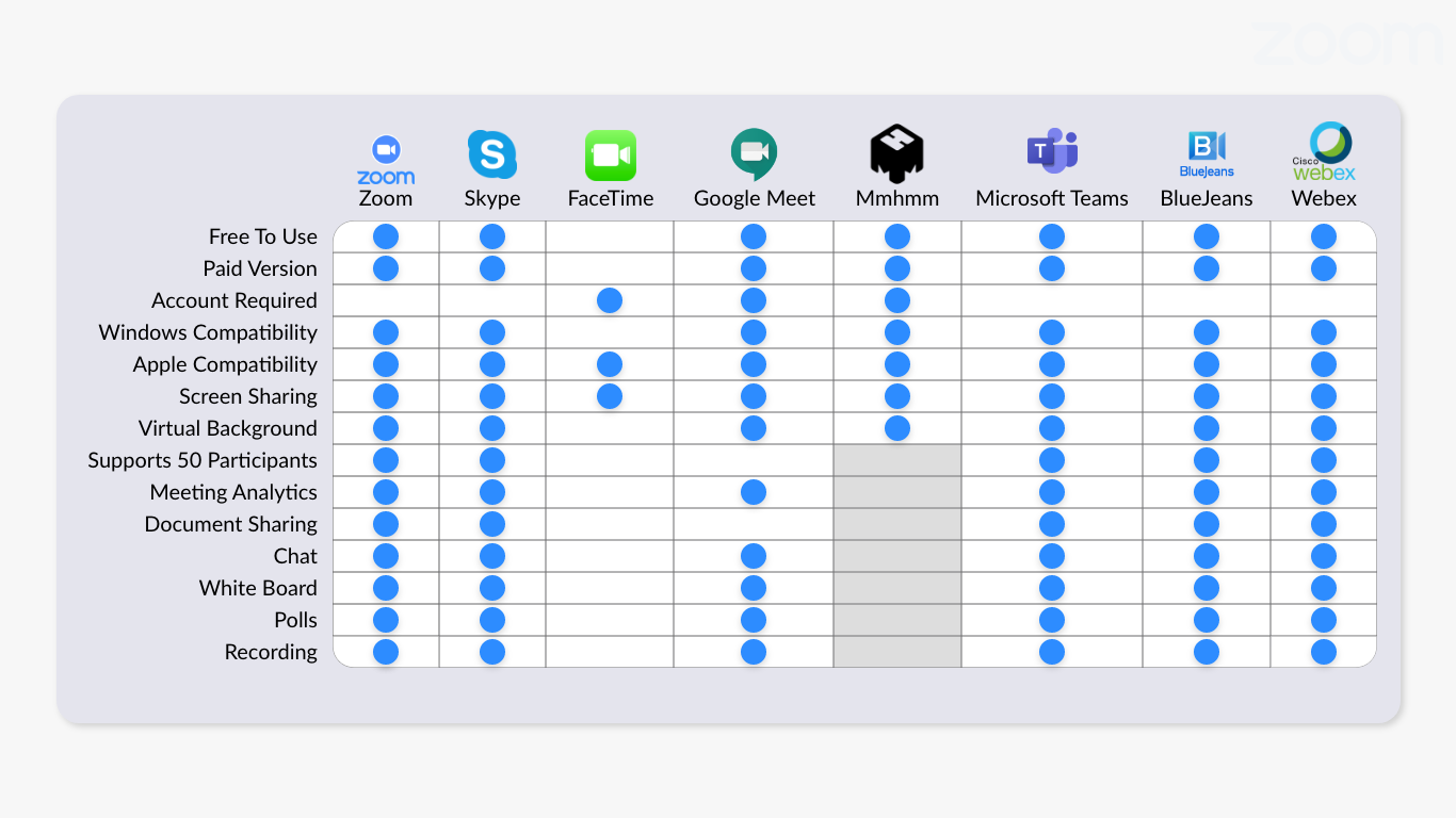
We looked at Zoom’s direct competitors in the hope that a feature inventory will tell us more about prioritization of features. We didn’t learn much from this analysis, except the fact that none of these companies offer customization, and that we had to look elsewhere for inspiration.
The solution: design, prototype, user test (and repeat)
To solve the problem and eliminate users’ pain points we decided to add a new feature called Toolbars — a customizable widget menu where the user can drag and drop the features that they most frequently use and save them to their navigational menu as a Toolbar.
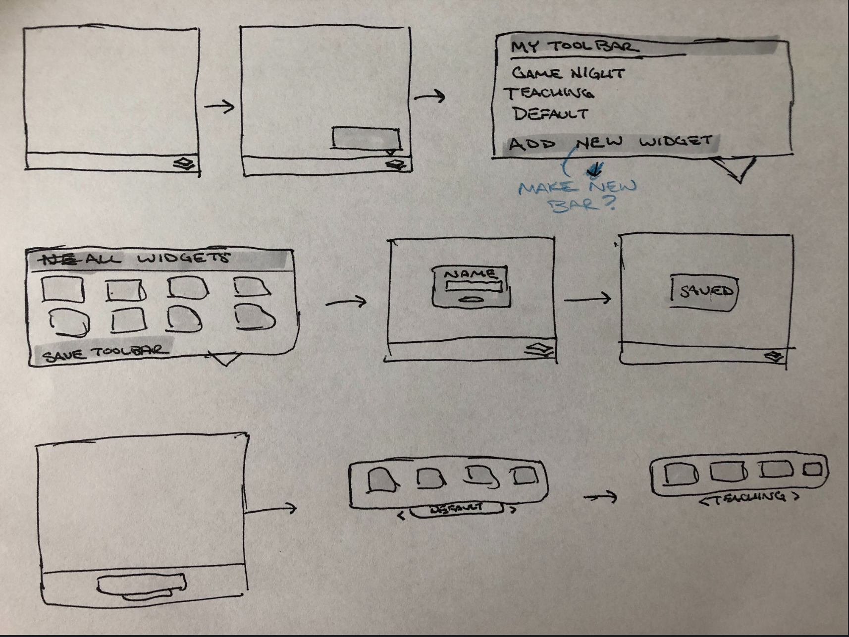
Initial Sketch
Icon creation
To kick off our design session we created sketches and mock ups that resulted in three different prototypes that were then tested with users. Out of the three designs users naturally picked the simplest, cleanest, and most useful design elements — the overall minimalistic look, the animated Toolbars Icon, the drag and drop gesture, on which we based our next iterations.
After we gathered and synthesized the data from the tests, there were divided opinions on using tabs or a one level navigation for widgets and toolbars. Therefore, we decided to create two new prototypes for an A/B usability test.
Prototype A had widgets and toolbars located on one card
Prototype B had separate tabs for widgets and toolbars.
Results showed that Prototype B was the overall favorite. Users preferred separate
tabs for widgets and toolbars because it was easier for them to use them.
Prototype A has one level navigation
Prototype B uses tabs to separate widgets from toolbars
Minimizing the steps to the desired function
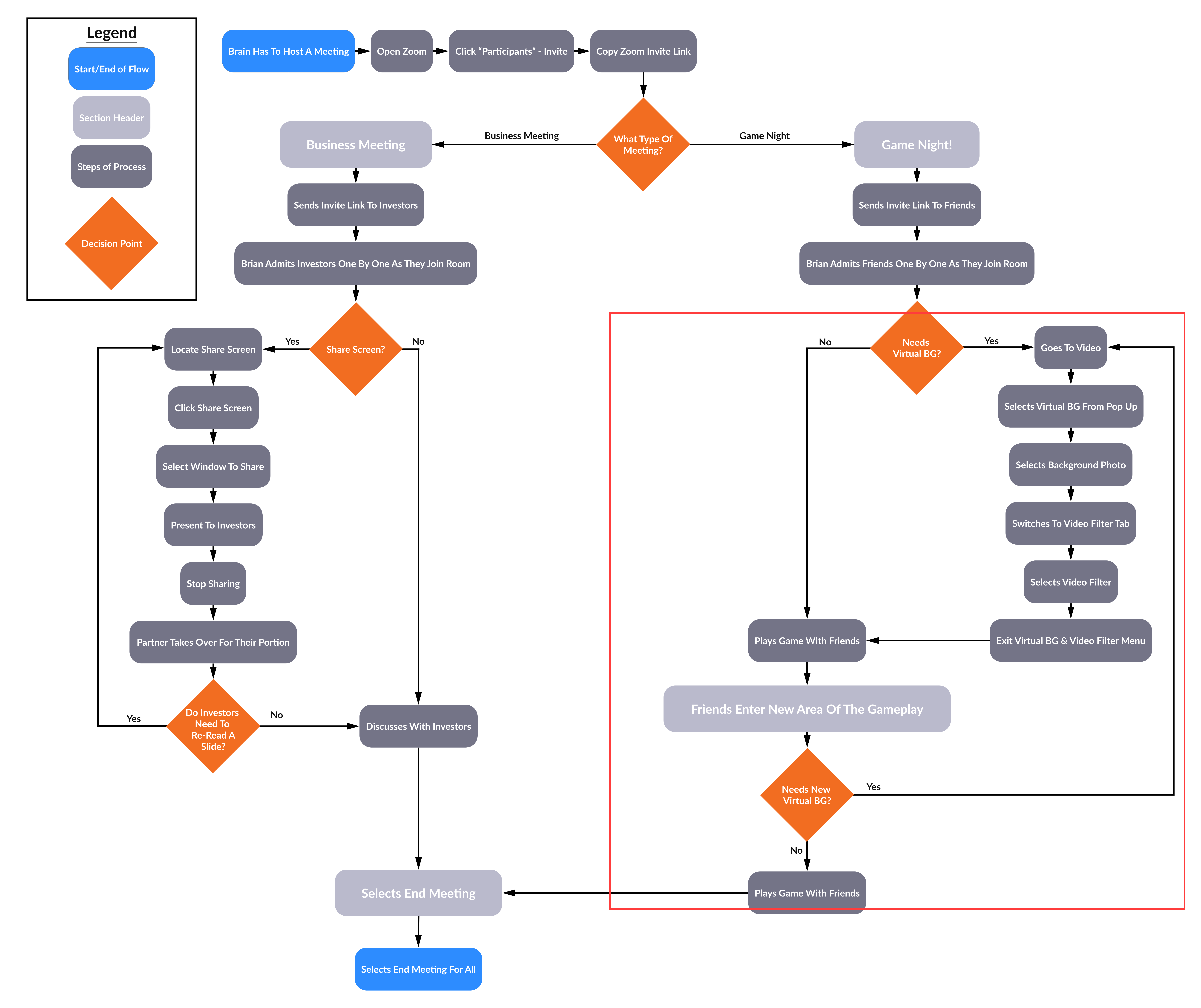
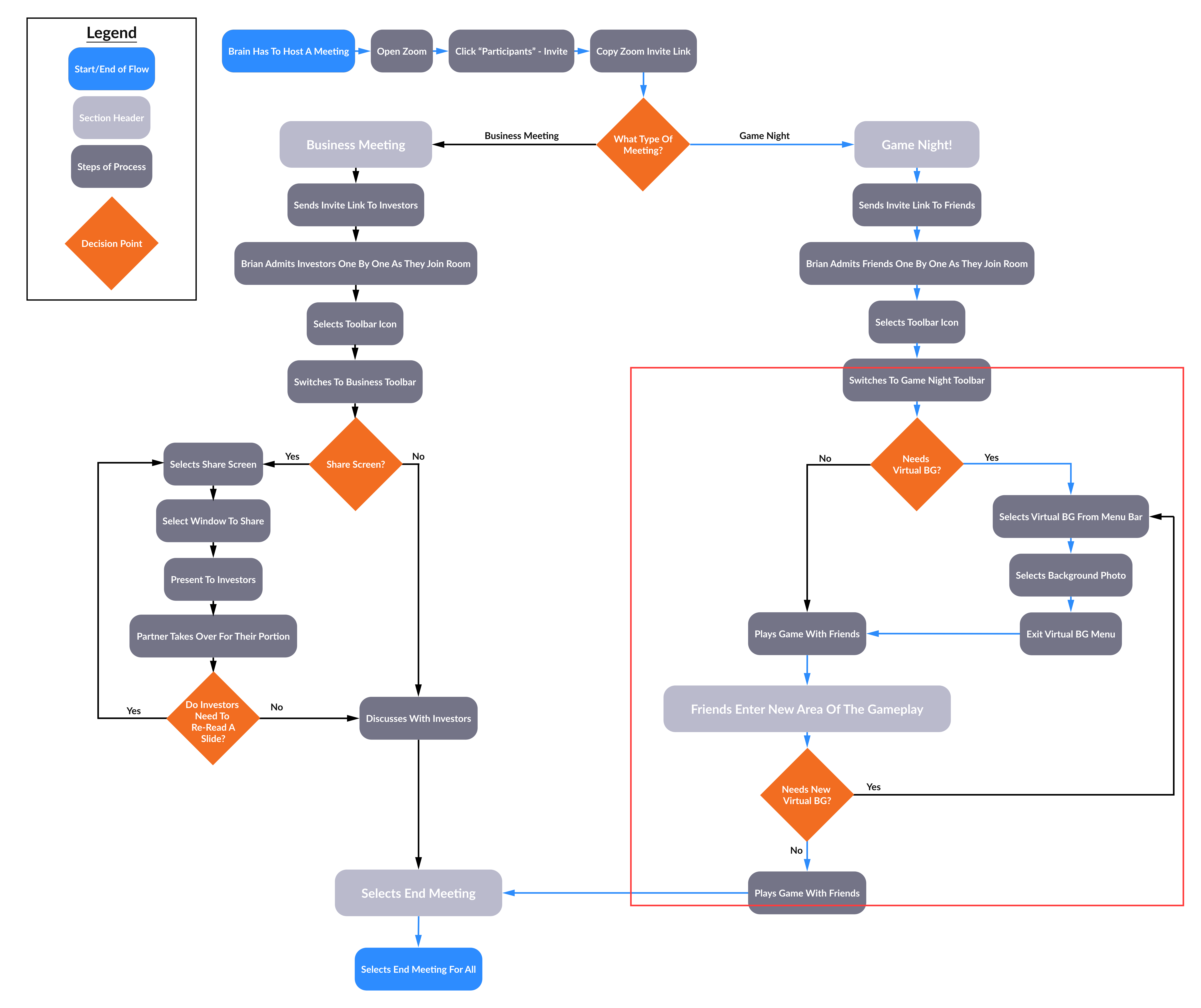
Below is Brian’s current and future user flows. In his current use, he has to go through seven steps to change his virtual background. And as the future flow shows, he is able to accomplish this action in three steps based on our changes to the Zoom interface i.e adding the new feature.

Current Zoom’s user flow
Future Zoom’s user flow
Final prototype showing how Toolbars feature works
To reduce the complexity of customization and show users the most commonly used options at first, I added a secondary preference within the advanced options section where you can access all available features in a list, and a search widgets option where users can quickly find widgets and add them to their toolbar.
